

Phytoplankton Community Composition (PCC) from the Multi Ordination ANAlysis (MOANA) algorithm#
Authors: Anna Windle (NASA, SSAI)
Code adapted from the PACE Data Visualization-Part 2 tutorial, developed by Carina Poulin (NASA, SSAI) and the MOANA tutorial presented by Ryan Vandermuelen (NOAA Fisheries) during the NOAA FishPACE Hackweek.
Last updated: August 12, 2026
The following notebooks are prerequisites for this tutorial.
Learn with OCI: Data Access
An Earthdata Login account is required to access data from the NASA Earthdata system, including NASA ocean color data.
Summary#
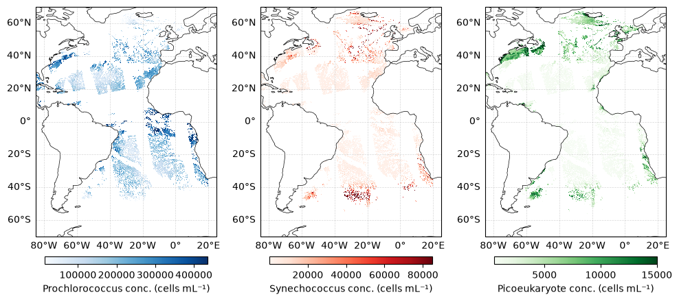
MOANA is the first phytoplankton community composition algorithm released for the PACE mission. The product provides near-surface concentrations (cells mL⁻¹) of three groups of picophytoplankton (i.e., phytoplankton <2 μm in size): Prochlorococcus, Synechococcus, and autotrophic picoeukaryotes. The algorithm is based on empirical relationships between measured phytoplankton cell concentrations, in situ hyperspectral remote sensing reflectances, and sea surface temperature. Further details on the algorithm and its development are provided by Lange et al. (2020). At present, the MOANA product is available only for the Atlantic Ocean, where it has been validated with in situ data.
Learning Objectives#
At the end of this notebook you will know:
Access MOANA data using
earthaccessVisualize all three phytoplankton groups simultaneously
Visualize monthly MOANA outputs
Create a monthly time series of phytoplankton abundance for a specified region
1. Setup#
Begin by importing all of the packages used in this notebook. If you followed the guidance on the Getting-Started page, then the imports will be successful.
import cartopy.crs as ccrs
import cartopy.feature as cfeature
import earthaccess
import matplotlib.pyplot as plt
import numpy as np
import xarray as xr

from matplotlib.patches import Polygon
from mpl_toolkits.axes_grid1.inset_locator import inset_axes
from matplotlib.patches import Rectangle
Assign “global” variables, which could be anything you want to define once and use consistently. For example your cartopy projection:
crs = ccrs.PlateCarree()
Set (and persist to your home directory on the host, if needed) your Earthdata Login credentials.
auth = earthaccess.login()
2. Access MOANA data#
MOANA data are available as Level-4 mapped products since the algorithm is applied to Level-3 mapped Rrs data, which provide spatially and temporally composited inputs for generating mapped phytoplankton community composition estimates.
It it currently only available for the Atlantic Ocean.
Let’s open a daily 4km product from May 4, 2026.
tspan = ("2026-05-04", "2026-05-04")

results = earthaccess.search_data(
    short_name=["PACE_OCI_L4m_MOANA_NRT", "PACE_OCI_L4m_MOANA"],
    temporal=tspan,
    granule_name="*.DAY.*4km*",
)
print(results)

moana_paths = earthaccess.open(results)
[Collection: {'Version': '3.2', 'ShortName': 'PACE_OCI_L4M_MOANA_NRT'}
Spatial coverage: {'HorizontalSpatialDomain': {'Geometry': {'GPolygons': [{'Boundary': {'Points': [{'Latitude': 60, 'Longitude': 7}, {'Latitude': 60, 'Longitude': -85}, {'Latitude': -55, 'Longitude': -85}, {'Latitude': -55, 'Longitude': 7}, {'Latitude': 60, 'Longitude': 7}]}}]}}}
Temporal coverage: {'RangeDateTime': {'EndingDateTime': '2026-05-04T23:59:59Z', 'BeginningDateTime': '2026-05-04T00:00:00Z'}}
Size(MB): 7.814210891723633
Data: ['https://obdaac-tea.earthdatacloud.nasa.gov/ob-cumulus-prod-public/PACE_OCI.20260504.L4m.DAY.MOANA.V3_2.4km.NRT.nc']]
Let’s open the file using xarray. There is currently a bug in the data where land pixels are being read as a value of 254. The code below corrects this issue by treating 254 as a missing value. This workaround will be removed once the data are corrected on Earthdata.
ds = xr.open_dataset(moana_paths[0])
for var in ["prococcus_moana", "syncoccus_moana", "picoeuk_moana"]:
    ds[var] = ds[var].where(ds[var] != 254)
ds
<xarray.Dataset> Size: 213MB
Dimensions:          (lat: 3360, lon: 2640, rgb: 3, eightbitcolor: 256)
Coordinates:
  * lat              (lat) float32 13kB 69.98 69.94 69.9 ... -69.9 -69.94 -69.98
  * lon              (lon) float32 11kB -84.98 -84.94 -84.9 ... 24.9 24.94 24.98
Dimensions without coordinates: rgb, eightbitcolor
Data variables:
    prococcus_moana  (lat, lon) float64 71MB nan nan nan nan ... nan nan nan nan
    syncoccus_moana  (lat, lon) float64 71MB nan nan nan nan ... nan nan nan nan
    picoeuk_moana    (lat, lon) float64 71MB nan nan nan nan ... nan nan nan nan
    palette          (rgb, eightbitcolor) uint8 768B ...
Attributes: (12/62)
    product_name:                      PACE_OCI.20260504.L4m.DAY.MOANA.V3_2.4...
    instrument:                        OCI
    title:                             OCI Level-3 Standard Mapped Image
    project:                           Ocean Biology Processing Group (NASA/G...
    platform:                          PACE
    source:                            satellite observations from OCI-PACE
    ...                                ...
    cdm_data_type:                     grid
    identifier_product_doi_authority:  http://dx.doi.org
    identifier_product_doi:            10.5067/PACE/OCI/L4M/MOANA/3.2
    data_bins:                         955061
    data_minimum:                      0.0
data_maximum: 1.5334073e+07We have three different phytoplankton classes in this dataset. Let’s plot them!
phyto_info = {
    "Prochlorococcus": {
        "data": ds["prococcus_moana"],
        "cmap": plt.cm.Blues,
        "label": "Prochlorococcus conc. (cells mL⁻¹)",
    },
    "Synechococcus": {
        "data": ds["syncoccus_moana"],
        "cmap": plt.cm.Reds,
        "label": "Synechococcus conc. (cells mL⁻¹)",
    },
    "Picoeukaryotes": {
        "data": ds["picoeuk_moana"],
        "cmap": plt.cm.Greens,
        "label": "Picoeukaryote conc. (cells mL⁻¹)",
    },
}

fig, axs = plt.subplots(
    1, 3, figsize=(10, 6), subplot_kw={"projection": ccrs.PlateCarree()}
)

for ax, (title, info) in zip(axs, phyto_info.items()):
    da = info["data"]
    da = da.where(da > 0)
    ax.set_title(title)

    img = da.plot(ax=ax, cmap=info["cmap"], robust=True, add_colorbar=False)

    ax.add_feature(cfeature.COASTLINE, linewidth=0.5)
    gl = ax.gridlines(
        draw_labels={"bottom": True, "left": True, "top": False, "right": False},
        linewidth=0.5,
        alpha=0.5,
        linestyle="--",
    )

    cbar = plt.colorbar(img, ax=ax, orientation="horizontal", pad=0.05, shrink=0.9)
    cbar.set_label(info["label"])

plt.tight_layout()
plt.show()
Let’s zoom into the East Coast of the U.S. using a bounding box with our chosen geographical coordinates:
bbox = [-80, -52, 30, 47]

fig, axs = plt.subplots(
    1, 3,
    figsize=(10, 5),
    subplot_kw={"projection": ccrs.PlateCarree()}
)

for i, (ax, (title, info)) in enumerate(
    zip(axs, phyto_info.items())
):

    da = info["data"].where(info["data"] > 0)

    ax.set_title(title)

    img = da.plot(
        ax=ax,
        cmap=info["cmap"],
        robust=True,
        add_colorbar=False
    )

    ax.set_extent(bbox, crs=ccrs.PlateCarree())

    ax.add_feature(
        cfeature.COASTLINE,
        linewidth=0.5
    )

    gl = ax.gridlines(
        draw_labels={
            "bottom": True,
            "left": i == 0,
            "top": False,
            "right": False
        },
        linewidth=0.5,
        alpha=0.5,
        linestyle="--"
    )

    cbar = plt.colorbar(
        img,
        ax=ax,
        orientation="horizontal",
        pad=0.05,
        shrink=0.9
    )

    cbar.set_label(info["label"])

plt.tight_layout()
plt.show()
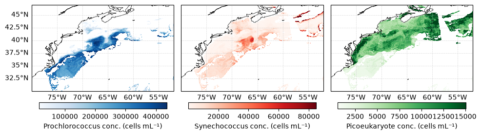
Here you can see that Prochlorococcus is more abundant in offshore waters whereas picoeukaryotes tend to be more dominant along the coast. And there seems to be a high abundance of Synechococcus in a feature near the Gulf Stream.
3. Visualize MOANA data as an RGB triplet#
The phytoplankton types can be combined into a single “false true-color” image, where each pixel is represented by an RGB triplet. The red, green, and blue channels correspond to Pro, Syn, and pico fractions, respectively. Because the three fractions at each pixel sum to 1, the resulting color directly represents their relative contributions. This visualization provides an intuitive, spatially explicit view of phytoplankton dominance, while blended colors reveal regions where multiple phytoplankton contribute substantially.
def robust_normalize(arr, vmin=None, vmax=None):
    if vmin is None or vmax is None:
        vmin, vmax = np.nanpercentile(arr, [2, 98])

    return np.clip((arr - vmin) / (vmax - vmin), 0, 1)

pro_norm = robust_normalize(ds["prococcus_moana"])
syn_norm = robust_normalize(ds["syncoccus_moana"])
pico_norm = robust_normalize(ds["picoeuk_moana"])

rgb_image = np.stack([syn_norm.values, pico_norm.values, pro_norm.values], axis=-1)

ds["rgb_image"] = xr.DataArray(
    rgb_image,
    dims=("lat", "lon", "rgb"),
    coords={"lat": ds.lat, "lon": ds.lon, "rgb": ["R", "G", "B"]},
)
We’ll plot this multi-dimensional image along with a legend:
fig, ax = plt.subplots(figsize=(10, 6), subplot_kw={"projection": ccrs.PlateCarree()})

ax.gridlines(
    crs=crs,
    draw_labels={
            "bottom": True,
            "left": True,
            "top": False,
            "right": False},
    linewidth=0.5,
    color="gray",
    alpha=0.5,
    linestyle="--",
    zorder=4,
)

ax.coastlines(linewidth=0.4, color="grey", zorder=3)

ax.add_feature(
    cfeature.NaturalEarthFeature(
        "physical",
        "ocean",
        "110m",
        edgecolor="face",
        facecolor="white",
    ),
    zorder=0,
)

ax.set_extent(bbox, crs=crs)

ax.imshow(
    ds["rgb_image"].values,
    origin="upper",
    extent=[
        float(ds.lon.min()),
        float(ds.lon.max()),
        float(ds.lat.min()),
        float(ds.lat.max()),
    ],
    transform=ccrs.PlateCarree(),
)

# ============================================================
# RGB triangle legend

triangle = np.array(
    [
        [0.5, np.sqrt(3) / 2],  # top = Pico (Green)
        [0, 0],  # bottom left = Syn (Red)
        [1, 0],  # bottom right = Pro (Blue)
    ]
)

# Create barycentric coordinates for triangle
res = 150
bary_coords = np.array(
    [
        [i / res, j / res, 1 - i / res - j / res]
        for i in range(res + 1)
        for j in range(res + 1 - i)
    ]
)
rgb_vals = bary_coords[:, [1, 0, 2]]  # R=Syn, G=Pico, B=Pro
rgb_vals = np.clip(rgb_vals, 0, 1)

# Convert to triangle (x, y) coordinates
xy_coords = (
    bary_coords[:, 0:1] * triangle[0]
    + bary_coords[:, 1:2] * triangle[1]
    + bary_coords[:, 2:3] * triangle[2]
)

legend_ax = inset_axes(
    ax,
    width="28%",
    height="60%",
    loc="center left",
    bbox_to_anchor=(0.55, -0.2, 1, 1),  # outside the map
    bbox_transform=ax.transAxes,
    borderpad=0,
)

legend_ax.set_aspect("equal")
legend_ax.axis("off")

legend_ax.scatter(
    xy_coords[:, 0],
    xy_coords[:, 1],
    c=rgb_vals,
    s=2,
)

legend_ax.add_patch(
    Polygon(
        triangle,
        closed=True,
        edgecolor="black",
        facecolor="none",
        linewidth=1,
    )
)

legend_ax.text(
    0.5,
    np.sqrt(3) / 2 + 0.05,
    "Picoeukaryotes",
    ha="center",
    fontsize=9,
)

legend_ax.text(
    -0.05,
    -0.05,
    "Synechococcus",
    ha="right",
    va="top",
    fontsize=9,
)

legend_ax.text(
    1.05,
    -0.05,
    "Prochlorococcus",
    ha="left",
    va="top",
    fontsize=9,
)

legend_ax.set_xlim(-0.15, 1.15)
legend_ax.set_ylim(-0.1, 1.0)

plt.subplots_adjust(right=0.80)
plt.show()
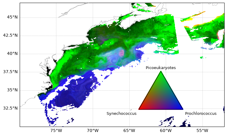
Ahh interesting! We can see a clear distinction between all three phytoplankton types.
4. Observing PCC changes over time#
Let’s examine how MOANA phytoplankton community composition changes over time within a specified region. We will start by searching for and opening the 2025 monthly MOANA composites for the year.
tspan = ("2025-01", "2025-12")
results_moana = earthaccess.search_data(
    short_name="PACE_OCI_L4M_MOANA",
    granule_name="*.MO.*0p1deg*",
    temporal=tspan,
)
path_files = earthaccess.open(results_moana)
Because we want to create a timeline, we will extract the date information from the dataset attributes using this time_from_attr function.
def time_from_attr(ds):
    """Set the time attribute as a dataset variable
    Args:
        ds: a dataset corresponding to one or multiple Level-2 granules
    Returns:
        the dataset with a scalar "time" coordinate
    """
    datetime = ds.attrs["time_coverage_start"].replace("Z", "")
    ds["date"] = ((), np.datetime64(datetime, "ns"))
    ds = ds.set_coords("date")
    return ds
We use time_from_attr as the preprocess function in xr.open_mfdataset. This extracts the date information from each file’s attributes, allowing the date to be added as a coordinate to the resulting dataset.
dataset_moana = xr.open_mfdataset(
    path_files, preprocess=time_from_attr, combine="nested", concat_dim="date"
)
dataset_moana
<xarray.Dataset> Size: 444MB
Dimensions:          (date: 12, lat: 1400, lon: 1100, rgb: 3, eightbitcolor: 256)
Coordinates:
  * date             (date) datetime64[ns] 96B 2025-01-01T00:27:38.217000 ......
  * lat              (lat) float32 6kB 69.95 69.85 69.75 ... -69.85 -69.95
  * lon              (lon) float32 4kB -84.95 -84.85 -84.75 ... 24.85 24.95
Dimensions without coordinates: rgb, eightbitcolor
Data variables:
    prococcus_moana  (date, lat, lon) float64 148MB dask.array<chunksize=(1, 16, 1024), meta=np.ndarray>
    syncoccus_moana  (date, lat, lon) float64 148MB dask.array<chunksize=(1, 16, 1024), meta=np.ndarray>
    picoeuk_moana    (date, lat, lon) float64 148MB dask.array<chunksize=(1, 16, 1024), meta=np.ndarray>
    palette          (date, rgb, eightbitcolor) uint8 9kB dask.array<chunksize=(1, 3, 256), meta=np.ndarray>
Attributes: (12/62)
    product_name:                      PACE_OCI.20250101_20250131.L4m.MO.MOAN...
    instrument:                        OCI
    title:                             OCI Level-3 Standard Mapped Image
    project:                           Ocean Biology Processing Group (NASA/G...
    platform:                          PACE
    source:                            satellite observations from OCI-PACE
    ...                                ...
    cdm_data_type:                     grid
    identifier_product_doi_authority:  http://dx.doi.org
    identifier_product_doi:            10.5067/PACE/OCI/L4M/MOANA/3.2
    data_bins:                         730550
    data_minimum:                      0.0
data_maximum: 6.7553715e+08Let’s crop the data to the bounding box we used before to zoom into the East Coast of the U.S.
bbox = [-80, -52, 30, 47]
lon_min, lon_max, lat_min, lat_max = bbox

dataset_crop = dataset_moana.sel(
    lon=slice(lon_min, lon_max), lat=slice(lat_max, lat_min)
)
dataset_crop
<xarray.Dataset> Size: 14MB
Dimensions:          (date: 12, lat: 170, lon: 280, rgb: 3, eightbitcolor: 256)
Coordinates:
  * date             (date) datetime64[ns] 96B 2025-01-01T00:27:38.217000 ......
  * lat              (lat) float32 680B 46.95 46.85 46.75 ... 30.25 30.15 30.05
  * lon              (lon) float32 1kB -79.95 -79.85 -79.75 ... -52.15 -52.05
Dimensions without coordinates: rgb, eightbitcolor
Data variables:
    prococcus_moana  (date, lat, lon) float64 5MB dask.array<chunksize=(1, 10, 280), meta=np.ndarray>
    syncoccus_moana  (date, lat, lon) float64 5MB dask.array<chunksize=(1, 10, 280), meta=np.ndarray>
    picoeuk_moana    (date, lat, lon) float64 5MB dask.array<chunksize=(1, 10, 280), meta=np.ndarray>
    palette          (date, rgb, eightbitcolor) uint8 9kB dask.array<chunksize=(1, 3, 256), meta=np.ndarray>
Attributes: (12/62)
    product_name:                      PACE_OCI.20250101_20250131.L4m.MO.MOAN...
    instrument:                        OCI
    title:                             OCI Level-3 Standard Mapped Image
    project:                           Ocean Biology Processing Group (NASA/G...
    platform:                          PACE
    source:                            satellite observations from OCI-PACE
    ...                                ...
    cdm_data_type:                     grid
    identifier_product_doi_authority:  http://dx.doi.org
    identifier_product_doi:            10.5067/PACE/OCI/L4M/MOANA/3.2
    data_bins:                         730550
    data_minimum:                      0.0
data_maximum: 6.7553715e+08We can see that the dataset contains 12 dates, corresponding to the monthly composites for 2025. We can now create a new variable containing the RGB triplet for each date:
pro = dataset_crop["prococcus_moana"]
syn = dataset_crop["syncoccus_moana"]
pico = dataset_crop["picoeuk_moana"]

pro_min, pro_max = pro.quantile([0.02, 0.98], dim=("date", "lat", "lon"))
syn_min, syn_max = syn.quantile([0.02, 0.98], dim=("date", "lat", "lon"))
pico_min, pico_max = pico.quantile([0.02, 0.98], dim=("date", "lat", "lon"))

pro_norm = robust_normalize(pro, pro_min, pro_max)
syn_norm = robust_normalize(syn, syn_min, syn_max)
pico_norm = robust_normalize(pico, pico_min, pico_max)

rgb_image = xr.concat(
    [syn_norm, pico_norm, pro_norm], dim="rgb"  # Red  # Green  # Blue
).assign_coords(rgb=["R", "G", "B"])

dataset_crop["rgb_image"] = rgb_image
dataset_crop
<xarray.Dataset> Size: 27MB
Dimensions:          (date: 12, lat: 170, lon: 280, rgb: 3, eightbitcolor: 256)
Coordinates:
  * date             (date) datetime64[ns] 96B 2025-01-01T00:27:38.217000 ......
  * lat              (lat) float32 680B 46.95 46.85 46.75 ... 30.25 30.15 30.05
  * lon              (lon) float32 1kB -79.95 -79.85 -79.75 ... -52.15 -52.05
  * rgb              (rgb) <U1 12B 'R' 'G' 'B'
    quantile         float64 8B 0.02
Dimensions without coordinates: eightbitcolor
Data variables:
    prococcus_moana  (date, lat, lon) float64 5MB dask.array<chunksize=(1, 10, 280), meta=np.ndarray>
    syncoccus_moana  (date, lat, lon) float64 5MB dask.array<chunksize=(1, 10, 280), meta=np.ndarray>
    picoeuk_moana    (date, lat, lon) float64 5MB dask.array<chunksize=(1, 10, 280), meta=np.ndarray>
    palette          (date, rgb, eightbitcolor) uint8 9kB dask.array<chunksize=(1, 3, 256), meta=np.ndarray>
    rgb_image        (rgb, date, lat, lon) float64 14MB 0.004933 ... 0.5946
Attributes: (12/62)
    product_name:                      PACE_OCI.20250101_20250131.L4m.MO.MOAN...
    instrument:                        OCI
    title:                             OCI Level-3 Standard Mapped Image
    project:                           Ocean Biology Processing Group (NASA/G...
    platform:                          PACE
    source:                            satellite observations from OCI-PACE
    ...                                ...
    cdm_data_type:                     grid
    identifier_product_doi_authority:  http://dx.doi.org
    identifier_product_doi:            10.5067/PACE/OCI/L4M/MOANA/3.2
    data_bins:                         730550
    data_minimum:                      0.0
data_maximum: 6.7553715e+08And plot monthly changes of the species distribution over time:
fig, axs = plt.subplots(
    3, 4, figsize=(10, 6), subplot_kw={"projection": ccrs.PlateCarree()}
)

axs = axs.flatten()

for i, ax in enumerate(axs):

    rgb = dataset_crop["rgb_image"].isel(date=i)

    rgb = rgb.transpose("lat", "lon", "rgb")

    ax.imshow(rgb, origin="upper", extent=bbox, transform=ccrs.PlateCarree())

    ax.coastlines(linewidth=0.4, color="grey", zorder=3)

    gl = ax.gridlines(
        draw_labels={
            "bottom": i >= 8,  # bottom row only
            "left": i % 4 == 0,  # first column only
            "top": False,
            "right": False,
        },
        linewidth=0.5,
        alpha=0.5,
        linestyle="--",
    )

    date = dataset_crop.date.isel(date=i).dt.strftime("%Y-%m-%d").item()
    ax.set_title(date, fontsize=10)

# ============================================================
# RGB triangle legend

triangle = np.array(
    [
        [0.5, np.sqrt(3) / 2],  # top = Pico (Green)
        [0, 0],  # bottom left = Syn (Red)
        [1, 0],  # bottom right = Pro (Blue)
    ]
)

# Create barycentric coordinates
res = 150

bary_coords = np.array(
    [
        [i / res, j / res, 1 - i / res - j / res]
        for i in range(res + 1)
        for j in range(res + 1 - i)
    ]
)

# Convert barycentric fractions to RGB
# R = Syn, G = Pico, B = Pro
rgb_vals = bary_coords[:, [1, 0, 2]]
rgb_vals = np.clip(rgb_vals, 0, 1)

# Convert barycentric coordinates to triangle coordinates
xy_coords = (
    bary_coords[:, 0:1] * triangle[0]
    + bary_coords[:, 1:2] * triangle[1]
    + bary_coords[:, 2:3] * triangle[2]
)

# Add inset axis
legend_ax = fig.add_axes([0.93, 0.4, 0.12, 0.18])

# Plot RGB triangle
legend_ax.scatter(
    xy_coords[:, 0], xy_coords[:, 1], c=rgb_vals, s=4, marker="s", linewidths=0
)

# Triangle outline
triangle_closed = np.vstack([triangle, triangle[0]])

legend_ax.plot(triangle_closed[:, 0], triangle_closed[:, 1], color="black", linewidth=1)

# Labels
legend_ax.text(0.5, np.sqrt(3) / 2 + 0.08, "Pico", ha="center", va="bottom", fontsize=9)

legend_ax.text(-0.04, -0.05, "Syn", ha="right", va="top", fontsize=9)

legend_ax.text(1.04, -0.05, "Pro", ha="left", va="top", fontsize=9)

# ============================================================

legend_ax.set_xlim(-0.15, 1.15)
legend_ax.set_ylim(-0.15, 1.05)
legend_ax.set_aspect("equal")
legend_ax.axis("off")

plt.subplots_adjust(hspace=-0.2, wspace=0.03)
plt.show()
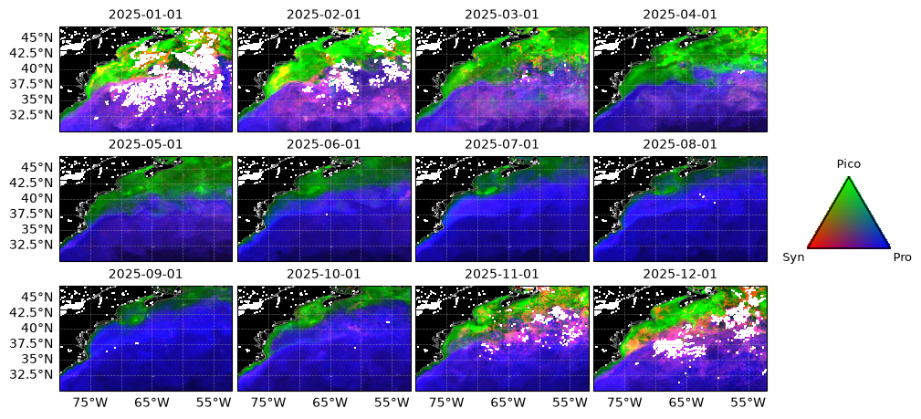
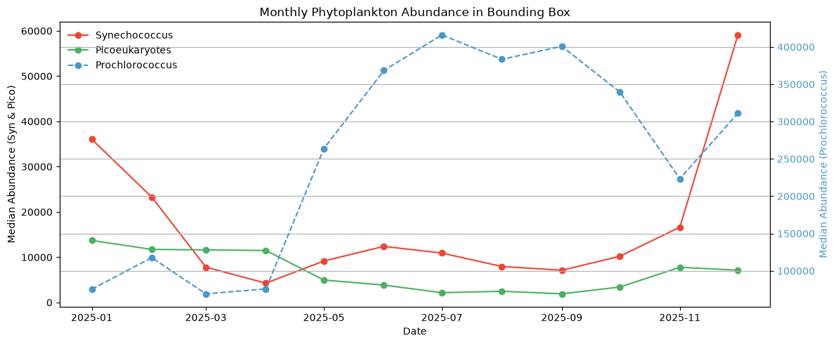
This monthly time series illustrates pronounced seasonal and spatial changes in picophytoplankton composition, including increased Prochlorococcus contributions offshore during summer and increased Synechococcus and picoeukaryote contributions during winter and spring.
Let’s see how picophytoplankton is changing over a specified region of interest. Let’s extract a 3 degree x 3 degree box in the North Atlantic. To visualize our region, we will plot it on a selected month’s image:
rgb = dataset_crop["rgb_image"].isel(date=5).transpose("lat", "lon", "rgb")

fig, ax = plt.subplots(figsize=(8, 5), subplot_kw={"projection": ccrs.PlateCarree()})

ax.imshow(rgb, origin="upper", extent=bbox, transform=ccrs.PlateCarree())

ax.coastlines(linewidth=0.6, color="grey", zorder=3)

gl = ax.gridlines(
    draw_labels={"bottom": True, "left": True, "top": False, "right": False},
    linewidth=0.5,
    alpha=0.5,
    linestyle="--",
)

lon_min, lon_max = -68, -66
lat_min, lat_max = 38, 40


ax.add_patch(
    Rectangle(
        (lon_min, lat_min),
        lon_max - lon_min,
        lat_max - lat_min,
        edgecolor="red",
        facecolor="none",
        linewidth=2,
        transform=ccrs.PlateCarree(),
    )
)

plt.tight_layout()
plt.show()
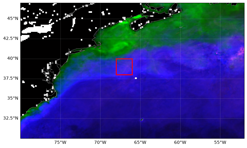
Let’s crop the data to this bounding box and calculate the median phytoplankton abundance for each group:
da = dataset_crop.sel(lat=slice(40, 38), lon=slice(-68, -66))

syn_ts = da["syncoccus_moana"].median(dim=["lat", "lon"])
pico_ts = da["picoeuk_moana"].median(dim=["lat", "lon"])
pro_ts = da["prococcus_moana"].median(dim=["lat", "lon"])
And plot the timeline of monthly median abundances!
fig, ax1 = plt.subplots(figsize=(12, 5))

custom_colors = {
    "Prochlorococcus": plt.cm.Blues(0.6),
    "Synechococcus": plt.cm.Reds(0.6),
    "Picoeukaryotes": plt.cm.Greens(0.6),
}

ax1.plot(
    syn_ts["date"],
    syn_ts,
    "o-",
    label="Synechococcus",
    color=custom_colors["Synechococcus"],
)
ax1.plot(
    pico_ts["date"],
    pico_ts,
    "o-",
    label="Picoeukaryotes",
    color=custom_colors["Picoeukaryotes"],
)
ax1.set_xlabel("Date")
ax1.set_ylabel("Median Abundance (Syn & Pico)", color="black")
ax1.tick_params(axis="y", labelcolor="black")

ax2 = ax1.twinx()
ax2.plot(
    pro_ts["date"],
    pro_ts,
    "o--",
    label="Prochlorococcus",
    color=custom_colors["Prochlorococcus"],
)
ax2.set_ylabel(
    "Median Abundance (Prochlorococcus)", color=custom_colors["Prochlorococcus"]
)
ax2.tick_params(axis="y", labelcolor=custom_colors["Prochlorococcus"])

lines_1, labels_1 = ax1.get_legend_handles_labels()
lines_2, labels_2 = ax2.get_legend_handles_labels()
ax1.legend(lines_1 + lines_2, labels_1 + labels_2, loc="upper left", frameon=False)

plt.title("Monthly Phytoplankton Abundance in Bounding Box")
plt.grid(True)
plt.xticks(rotation=45)
plt.tight_layout()
plt.show()
You have completed the notebook on the MOANA algorithm!