

Satellite Data Visualization#
Updated July 23, 2026
Authors: Carina Poulin (NASA, SSAI), Ian Carroll (NASA, UMBC), and Sean Foley (NASA, MSU)
The following notebooks are prerequisites for this tutorial:
Summary#
This is an introductory tutorial to the visualization possibilities arising from PACE data, meant to give you ideas and tools to develop your own scientific data visualizations.
Learning Objectives#
At the end of this notebook you will know:
How to create an easy global map from OCI data from the cloud
How to create a true-color image from OCI data processed with OCSSW
How to make a false color image to look at clouds
How to make an interactive tool to explore OCI data
What goes into an animation of multi-angular HARP2 data
1. Setup#
Begin by importing all of the packages used in this notebook. If you followed the guidance on the Getting Started page, then the imports will be successful.
import cartopy.crs as ccrs
import cmocean
import earthaccess
import holoviews as hv
import matplotlib.pylab as pl
import matplotlib.pyplot as plt
import numpy as np
import panel.widgets as pnw
import xarray as xr
from holoviews.streams import Tap
from matplotlib import animation
from matplotlib.colors import ListedColormap
from PIL import Image, ImageEnhance
from scipy.ndimage import gaussian_filter1d
auth = earthaccess.login()
options = xr.set_options(display_expand_attrs=False)
In this tutorial, we suppress runtime warnings that show up when calculating log for negative values, which is common with our datasets.
Define a function to apply enhancements, our own plus generic image enhancements from the Pillow package.
def enhance(
rgb,
scale=0.01,
vmin=0.01,
vmax=1.04,
gamma=0.95,
contrast=1.2,
brightness=1.02,
sharpness=2,
saturation=1.1,
):
"""Follow the SeaDAS recipe for RGB images from Ocean Color missions.
Args:
rgb: a data array with three dimensions, having 3 or 4 bands in the third dimension
scale: scale value for the log transform
vmin: minimum pixel value for the image
vmax: maximum pixel value for the image
gamma: exponential factor for gamma correction
contrast: amount of pixel value differentiation
brightness: pixel values (intensity)
sharpness: amount of detail
saturation: color intensity
Returns:
a transformed data array better for RGB display
"""
rgb = rgb.where(rgb > 0)
rgb = np.log(rgb / scale) / np.log(1 / scale)
rgb = rgb.where(rgb >= vmin, vmin)
rgb = rgb.where(rgb <= vmax, vmax)
rgb_min = rgb.min(("number_of_lines", "pixels_per_line"))
rgb_max = rgb.max(("number_of_lines", "pixels_per_line"))
rgb = (rgb - rgb_min) / (rgb_max - rgb_min)
rgb = rgb * gamma
img = rgb * 255
img = img.where(img.notnull(), 0).astype("uint8")
img = Image.fromarray(img.data)
enhancer = ImageEnhance.Contrast(img)
img = enhancer.enhance(contrast)
enhancer = ImageEnhance.Brightness(img)
img = enhancer.enhance(brightness)
enhancer = ImageEnhance.Sharpness(img)
img = enhancer.enhance(sharpness)
enhancer = ImageEnhance.Color(img)
img = enhancer.enhance(saturation)
rgb[:] = np.array(img) / 255
return rgb
def enhancel3(
rgb,
scale=0.01,
vmin=0.01,
vmax=1.02,
gamma=0.95,
contrast=1.5,
brightness=1.02,
sharpness=2,
saturation=1.1,
):
rgb = rgb.where(rgb > 0)
rgb = np.log(rgb / scale) / np.log(1 / scale)
rgb = (rgb - rgb.min()) / (rgb.max() - rgb.min())
rgb = rgb * gamma
img = rgb * 255
img = img.where(img.notnull(), 0).astype("uint8")
img = Image.fromarray(img.data)
enhancer = ImageEnhance.Contrast(img)
img = enhancer.enhance(contrast)
enhancer = ImageEnhance.Brightness(img)
img = enhancer.enhance(brightness)
enhancer = ImageEnhance.Sharpness(img)
img = enhancer.enhance(sharpness)
enhancer = ImageEnhance.Color(img)
img = enhancer.enhance(saturation)
rgb[:] = np.array(img) / 255
return rgb
def pcolormesh(rgb):
fig = plt.figure()
axes = fig.add_subplot()
artist = axes.pcolormesh(
rgb["longitude"],
rgb["latitude"],
rgb,
shading="nearest",
rasterized=True,
)
axes.set_aspect("equal")
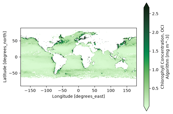
2. Easy Global Chlorophyll-a Map#
Let’s start with the most basic visualization. First, get level-3 chlorophyll map product, which is already gridded on latitudes and longitudes.
results = earthaccess.search_data(
short_name="PACE_OCI_L3M_BGC",
granule_name="*.MO.*.0p1deg.*",
count=1,
)
paths = earthaccess.open(results)
dataset = xr.open_dataset(paths[-1])
chla = dataset["chlor_a"]
Now we can already create a global map. Let’s use a special colormap from cmocean to be fancy, but this is not necessary to make a basic map. Use the robust="true" option to remove outliers.
artist = chla.plot(cmap=cmocean.cm.algae, robust="true")
plt.gca().set_aspect("equal")
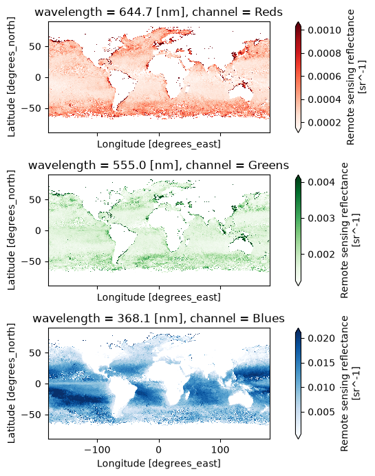
3. Global Oceans in Quasi True Color#
True color images use three bands to create a RGB image. Let’s still use a level-3 mapped product, this time we use the remote-sensing reflectance (Rrs) product in the AOP suite.
results = earthaccess.search_data(
short_name="PACE_OCI_L3M_AOP",
granule_name="*.MO.*.0p1deg.*",
count=1,
)
paths = earthaccess.open(results)
The Level-3 Mapped files have no groups and have variables that XArray recognizes as “coordinates”: variables that are named after their only dimension.
dataset = xr.open_dataset(paths[-1])
Look at all the wavelentghs available!
dataset["wavelength"]
<xarray.DataArray 'wavelength' (wavelength: 172)> Size: 688B
array([346.017, 348.468, 350.912, 353.344, 355.782, 358.235, 360.695, 363.137,
365.61 , 368.083, 370.534, 372.991, 375.482, 377.926, 380.419, 382.876,
385.359, 387.811, 390.297, 392.764, 395.238, 397.706, 400.178, 402.654,
405.127, 407.605, 410.074, 412.557, 415.025, 417.512, 419.988, 422.453,
424.94 , 427.398, 429.885, 432.379, 434.869, 437.351, 439.828, 442.327,
444.811, 447.309, 449.795, 452.28 , 454.769, 457.262, 459.757, 462.252,
464.737, 467.244, 469.729, 472.202, 474.7 , 477.189, 479.689, 482.183,
484.689, 487.182, 489.674, 492.176, 494.686, 497.182, 499.688, 502.19 ,
504.695, 507.198, 509.72 , 512.213, 514.729, 517.219, 519.747, 522.249,
524.771, 527.276, 529.798, 532.314, 534.859, 537.346, 539.878, 542.395,
544.904, 547.441, 549.994, 552.511, 555.044, 557.576, 560.104, 562.642,
565.19 , 567.71 , 570.259, 572.796, 575.343, 577.902, 580.45 , 582.996,
585.553, 588.086, 612.73 , 615.145, 617.605, 620.061, 622.53 , 624.988,
627.434, 629.898, 632.376, 634.83 , 637.305, 639.791, 641.029, 642.255,
643.479, 644.716, 645.966, 647.188, 648.435, 649.667, 650.913, 652.153,
653.388, 654.622, 655.869, 657.101, 658.34 , 659.6 , 660.833, 662.067,
663.3 , 664.564, 665.795, 667.023, 668.263, 669.518, 670.755, 671.99 ,
673.245, 674.503, 675.731, 676.963, 678.208, 679.448, 680.68 , 681.919,
683.171, 684.417, 685.657, 686.894, 688.143, 689.394, 690.647, 691.888,
693.13 , 694.382, 695.644, 696.891, 698.118, 699.376, 700.612, 701.858,
703.097, 704.354, 705.593, 706.833, 708.089, 709.337, 710.581, 711.826,
713.068, 714.316, 716.817, 719.298], dtype=float32)
Coordinates:
* wavelength (wavelength) float32 688B 346.0 348.5 350.9 ... 716.8 719.3
Attributes: (4)For a true color image, choose three wavelengths to represent the “Red”, “Green”, and “Blue” channels used to make true color images.
rrs_rgb = dataset["Rrs"].sel({"wavelength": [645, 555, 368]}, method="nearest")
rrs_rgb
<xarray.DataArray 'Rrs' (lat: 1800, lon: 3600, wavelength: 3)> Size: 78MB [19440000 values with dtype=float32] Coordinates: * lat (lat) float32 7kB 89.95 89.85 89.75 ... -89.75 -89.85 -89.95 * lon (lon) float32 14kB -179.9 -179.9 -179.8 ... 179.8 179.9 180.0 * wavelength (wavelength) float32 12B 644.7 555.0 368.1 Attributes: (8)
It is always a good practice to build meaningful labels into the dataset, and we’ll see next that it can be very useful as we learn to use metadata while creating visualizations.
For this case, we can attach another variable called “channel” and then swap it with
“wavelength” to become the third dimension of the data array. We’ll actually use these
values for a choice of cmap below, just for fun.
rrs_rgb["channel"] = ("wavelength", ["Reds", "Greens", "Blues"])
rrs_rgb = rrs_rgb.swap_dims({"wavelength": "channel"})
rrs_rgb
<xarray.DataArray 'Rrs' (lat: 1800, lon: 3600, channel: 3)> Size: 78MB
[19440000 values with dtype=float32]
Coordinates:
* lat (lat) float32 7kB 89.95 89.85 89.75 ... -89.75 -89.85 -89.95
* lon (lon) float32 14kB -179.9 -179.9 -179.8 ... 179.8 179.9 180.0
* channel (channel) <U6 72B 'Reds' 'Greens' 'Blues'
wavelength (channel) float32 12B 644.7 555.0 368.1
Attributes: (8)A complicated figure can be assembled fairly easily using the xarray.Dataset.plot method,
which draws on the matplotlib package. For Level-3 data, we can specifically use imshow
to visualize the RGB image on the lat and lon coordinates.
fig, axs = plt.subplots(3, 1, figsize=(8, 7), sharex=True)
for i, item in enumerate(rrs_rgb["channel"]):
array = rrs_rgb.sel({"channel": item})
array.plot.imshow(x="lon", y="lat", cmap=item.item(), ax=axs[i], robust=True)
axs[i].set_aspect("equal")
fig.tight_layout()
plt.show()
We use the enhancel3 function defined at the start of the tutorial to make adjusments to the image.
rrs_rgb_enhanced = enhancel3(rrs_rgb)
And we create the image using the imshow function.
artist = rrs_rgb_enhanced.plot.imshow(x="lon", y="lat")
plt.gca().set_aspect("equal")
Finally, we can add a grid and coastlines to the map with cartopy tools.
plt.figure(figsize=(7, 5))
ax = plt.axes(projection=ccrs.PlateCarree())
artist = rrs_rgb_enhanced.plot.imshow(x="lon", y="lat")
ax.gridlines(draw_labels={"left": "y", "bottom": "x"}, color="white", linewidth=0.3)
ax.coastlines(color="white", linewidth=1)
plt.show()
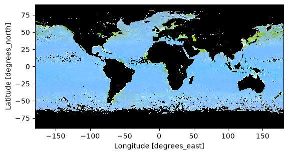
4. Complete Scene in True Color#
The best product to create a high-quality true-color image from PACE is the Surface Reflectance (rhos). Cloud-masked rhos are distributed in the SFREFL product suite. If you want to create an image that includes clouds, however, you need to process a Level-1B file to Level-2 using l2gen, like we will show in the OCSSW data processing exercise.
All files created by a PACE Hackweek tutorial can be found in the /shared/pace-hackweek-2024/ folder accessible from the JupyterLab file browser. In this tutorial, we’ll use a Level-2 file created in advance. Note that the JupyterLab file browser treats /home/jovyan (that’s your home directory, Jovyan) as the root of the browsable file system.
tspan = ("2024-06-05", "2024-06-05")
location = (44, 36)
The search_data method accepts a point argument for this type of location.
results = earthaccess.search_data(
short_name="PACE_OCI_L2_SFREFL",
temporal=tspan,
point=location,
)
results[0]

paths = earthaccess.open(results)
dataset = xr.open_dataset(paths[0])
dataset
<xarray.Dataset> Size: 0B
Dimensions: ()
Data variables:
*empty*
Attributes: (47)datatree = xr.open_datatree(paths[0])
datatree
<xarray.DataTree>
Group: /
│ Attributes: (47)
├── Group: /sensor_band_parameters
│ Dimensions: (number_of_bands: 286, number_of_reflective_bands: 286,
│ wavelength_3d: 122)
│ Coordinates:
│ * wavelength_3d (wavelength_3d) float64 976B 346.0 351.0 ... 2.258e+03
│ Dimensions without coordinates: number_of_bands, number_of_reflective_bands
│ Data variables:
│ wavelength (number_of_bands) float64 2kB ...
│ vcal_gain (number_of_reflective_bands) float32 1kB ...
│ vcal_offset (number_of_reflective_bands) float32 1kB ...
│ F0 (number_of_reflective_bands) float32 1kB ...
│ aw (number_of_reflective_bands) float32 1kB ...
│ bbw (number_of_reflective_bands) float32 1kB ...
│ k_oz (number_of_reflective_bands) float32 1kB ...
│ k_no2 (number_of_reflective_bands) float32 1kB ...
│ Tau_r (number_of_reflective_bands) float32 1kB ...
├── Group: /scan_line_attributes
│ Dimensions: (number_of_lines: 1710)
│ Dimensions without coordinates: number_of_lines
│ Data variables: (12/13)
│ year (number_of_lines) float64 14kB ...
│ day (number_of_lines) int64 14kB ...
│ msec (number_of_lines) int64 14kB ...
│ time (number_of_lines) datetime64[ns] 14kB ...
│ detnum (number_of_lines) float32 7kB ...
│ mside (number_of_lines) float32 7kB ...
│ ... ...
│ clon (number_of_lines) float32 7kB ...
│ elon (number_of_lines) float32 7kB ...
│ slat (number_of_lines) float32 7kB ...
│ clat (number_of_lines) float32 7kB ...
│ elat (number_of_lines) float32 7kB ...
│ csol_z (number_of_lines) float32 7kB ...
├── Group: /geophysical_data
│ Dimensions: (number_of_lines: 1710, pixels_per_line: 1272, wavelength_3d: 122)
│ Dimensions without coordinates: number_of_lines, pixels_per_line, wavelength_3d
│ Data variables:
│ rhos (number_of_lines, pixels_per_line, wavelength_3d) float32 1GB ...
│ l2_flags (number_of_lines, pixels_per_line) int32 9MB ...
├── Group: /navigation_data
│ Dimensions: (number_of_lines: 1710, pixels_per_line: 1272)
│ Dimensions without coordinates: number_of_lines, pixels_per_line
│ Data variables:
│ longitude (number_of_lines, pixels_per_line) float32 9MB ...
│ latitude (number_of_lines, pixels_per_line) float32 9MB ...
│ tilt (number_of_lines) float32 7kB ...
│ Attributes: (3)
└── Group: /processing_control
│ Attributes: (5)
├── Group: /processing_control/input_parameters
│ Attributes: (256)
└── Group: /processing_control/flag_percentages
Attributes: (28)The longitude and latitude variables are geolocation arrays, and while they are spatial coordinates they cannot be set as an index on the dataset because each array is itself two-dimensional. The rhos are not on a rectangular grid, but it is still useful to tell XArray what will become axis labels.
dataset = xr.merge(datatree.to_dict().values())
dataset = dataset.set_coords(("longitude", "latitude"))
dataset
<xarray.Dataset> Size: 1GB
Dimensions: (number_of_bands: 286, number_of_reflective_bands: 286,
wavelength_3d: 122, number_of_lines: 1710,
pixels_per_line: 1272)
Coordinates:
* wavelength_3d (wavelength_3d) float64 976B 346.0 351.0 ... 2.258e+03
longitude (number_of_lines, pixels_per_line) float32 9MB ...
latitude (number_of_lines, pixels_per_line) float32 9MB ...
Dimensions without coordinates: number_of_bands, number_of_reflective_bands,
number_of_lines, pixels_per_line
Data variables: (12/25)
wavelength (number_of_bands) float64 2kB ...
vcal_gain (number_of_reflective_bands) float32 1kB ...
vcal_offset (number_of_reflective_bands) float32 1kB ...
F0 (number_of_reflective_bands) float32 1kB ...
aw (number_of_reflective_bands) float32 1kB ...
bbw (number_of_reflective_bands) float32 1kB ...
... ...
clat (number_of_lines) float32 7kB ...
elat (number_of_lines) float32 7kB ...
csol_z (number_of_lines) float32 7kB ...
rhos (number_of_lines, pixels_per_line, wavelength_3d) float32 1GB ...
l2_flags (number_of_lines, pixels_per_line) int32 9MB ...
tilt (number_of_lines) float32 7kB ...
Attributes: (47)We then select the three wavelenghts that will become the red, green and blue chanels in our image.
rhos_rgb = dataset["rhos"].sel({"wavelength_3d": [645, 555, 368]}, method='nearest')
rhos_rgb
<xarray.DataArray 'rhos' (number_of_lines: 1710, pixels_per_line: 1272,
wavelength_3d: 3)> Size: 26MB
[6525360 values with dtype=float32]
Coordinates:
longitude (number_of_lines, pixels_per_line) float32 9MB ...
latitude (number_of_lines, pixels_per_line) float32 9MB ...
* wavelength_3d (wavelength_3d) float64 24B 645.0 555.0 366.0
Dimensions without coordinates: number_of_lines, pixels_per_line
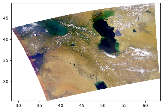
Attributes: (3)We are ready to have a look at our image. The most simple adjustment is normalization of the range across the three RGB channels.
rhos_rgb_max = rhos_rgb.max()
rhos_rgb_min = rhos_rgb.min()
rhos_rgb_enhanced = (rhos_rgb - rhos_rgb_min) / (rhos_rgb_max - rhos_rgb_min)
To visualize these data, we have to use the fairly smart pcolormesh artists, which interprets
the geolocation arrays as pixel centers.
pcolormesh(rhos_rgb_enhanced)
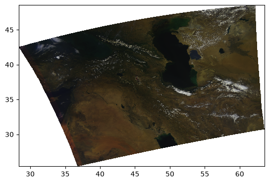
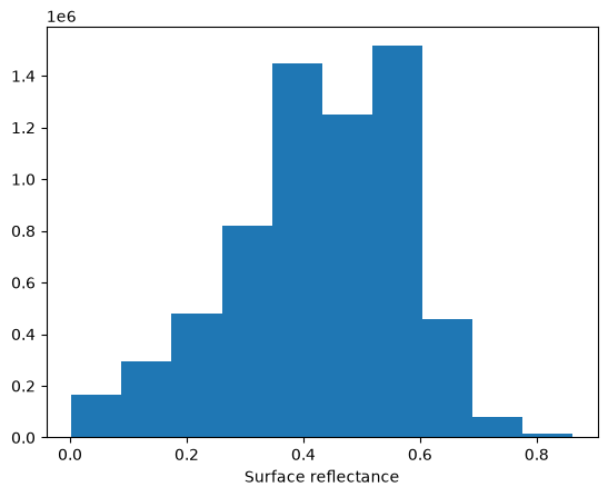
Let’s have a look at the image’s histogram that shows the pixel intensity value distribution across the image. Here, we can see that the values are skewed towards the low intensities, which makes the image dark.
rhos_rgb_enhanced.plot.hist()
(array([2.214147e+06, 2.803494e+06, 1.220750e+06, 1.834930e+05,
5.034400e+04, 2.874800e+04, 1.721000e+04, 6.651000e+03,
5.130000e+02, 1.000000e+01]),
array([0. , 0.1 , 0.2 , 0.30000001, 0.40000001,
0.5 , 0.60000002, 0.69999999, 0.80000001, 0.90000004,
1. ]),
<BarContainer object of 10 artists>)

Another type of enhancement involves a logarithmic transform of the data before normalizing to the unit range.
rhos_rgb_enhanced = rhos_rgb.where(rhos_rgb > 0, np.nan)
rhos_rgb_enhanced = np.log(rhos_rgb_enhanced / 0.01) / np.log(1 / 0.01)
rhos_rgb_max = rhos_rgb_enhanced.max()
rhos_rgb_min = rhos_rgb_enhanced.min()
rhos_rgb_enhanced = (rhos_rgb_enhanced - rhos_rgb_min) / (rhos_rgb_max - rhos_rgb_min)
pcolormesh(rhos_rgb_enhanced)
Perhaps it is better to do the unit normalization independently for each channel? We can use XArray’s ability to use and align labelled dimensions for the calculation.
rhos_rgb_max = rhos_rgb.max(("number_of_lines", "pixels_per_line"))
rhos_rgb_min = rhos_rgb.min(("number_of_lines", "pixels_per_line"))
rhos_rgb_enhanced = (rhos_rgb - rhos_rgb_min) / (rhos_rgb_max - rhos_rgb_min)
pcolormesh(rhos_rgb_enhanced)
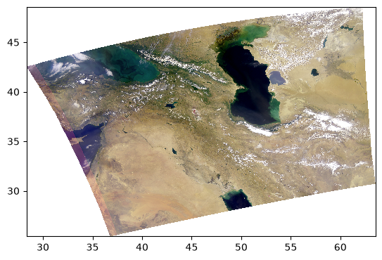
Let’s go back to the log-transformed image, but this time adjust the minimum and maximum pixel values vmin and vmax.
rhos_rgb_enhanced = rhos_rgb.where(rhos_rgb > 0, np.nan)
rhos_rgb_enhanced = np.log(rhos_rgb_enhanced / 0.01) / np.log(1 / 0.01)
vmin = 0.01
vmax = 1.04
rhos_rgb_enhanced = rhos_rgb_enhanced.where(rhos_rgb_enhanced <= vmax, vmax)
rhos_rgb_enhanced = rhos_rgb_enhanced.where(rhos_rgb_enhanced >= vmin, vmin)
rhos_rgb_max = rhos_rgb.max(("number_of_lines", "pixels_per_line"))
rhos_rgb_min = rhos_rgb.min(("number_of_lines", "pixels_per_line"))
rhos_rgb_enhanced = (rhos_rgb_enhanced - rhos_rgb_min) / (rhos_rgb_max - rhos_rgb_min)
pcolormesh(rhos_rgb_enhanced)
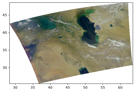
This image looks much more balanced. The histogram is also going to indicate this:
rhos_rgb_enhanced.plot.hist()
(array([ 164629., 295383., 479648., 820483., 1448832., 1249900.,
1515172., 456829., 78863., 15621.]),
array([0.00240269, 0.08833445, 0.17426622, 0.26019798, 0.34612975,
0.43206151, 0.51799328, 0.60392505, 0.68985681, 0.77578858,
0.86172034]),
<BarContainer object of 10 artists>)
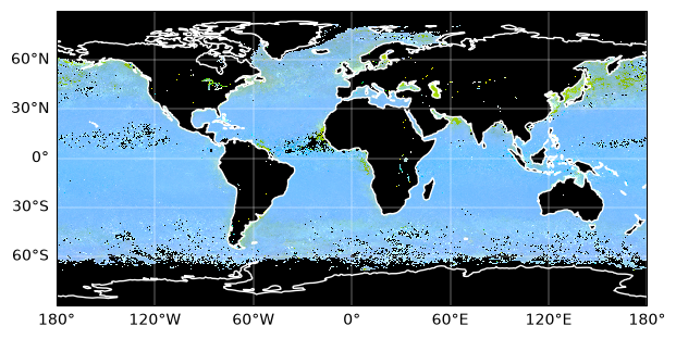
Everything we’ve been trying is already built into the enhance function, including extra goodies from the Pillow package of generic image processing filters.
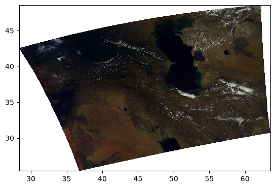
rhos_rgb_enhanced = enhance(rhos_rgb)
pcolormesh(rhos_rgb_enhanced)
Since every image is unique, we can further adjust the parameters.
rhos_rgb_enhanced = enhance(rhos_rgb, contrast=1.2, brightness=1.1, saturation=0.8)
pcolormesh(rhos_rgb_enhanced)
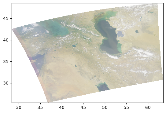
5. False Color for Ice Clouds#
We can use the same RGB image method, this time with different bands, to create false-color images that highlight specific elements in an image.
For example, using a combination of infrared bands can highlight ice clouds in the atmosphere, versus regular water vapor clouds. Let’s try it:
rhos_ice = dataset["rhos"].sel({"wavelength_3d": [1618, 2131, 2258]})
rhos_ice_enhanced = enhance(
rhos_ice,
vmin=0,
vmax=0.9,
scale=0.1,
gamma=1,
contrast=1,
brightness=1,
saturation=1,
)
pcolormesh(rhos_ice_enhanced)
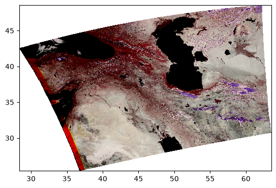
Here, the ice clouds are purple and water vapor clouds are white, like we can see in the northwestern region of the scene.
6. Full Spectra from Global Oceans#
This section contains interactive plots that require a live Python kernel. Not all the widgets will work when viewing the notebook; the cells have to be executed and the kernel still running. Download the notebook and give it a try!
The holoview library and its bokeh extension allow us to explore datasets interactively.
hv.extension("bokeh")

 ⓘ
ⓘ
Let’s open a level 3 Rrs map.
results = earthaccess.search_data(
short_name="PACE_OCI_L3M_AOP",
granule_name="*.MO.*0p1deg.*",
count=1,
)
paths = earthaccess.open(results)
We can create a map from a single band in the dataset and see the Rrs value by hovering over the map.
dataset = xr.open_dataset(paths[0])
dataset
<xarray.Dataset> Size: 5GB
Dimensions: (lat: 1800, lon: 3600, wavelength: 172)
Coordinates:
* lat (lat) float32 7kB 89.95 89.85 89.75 ... -89.75 -89.85 -89.95
* lon (lon) float32 14kB -179.9 -179.9 -179.8 ... 179.8 179.9 180.0
* wavelength (wavelength) float32 688B 346.0 348.5 350.9 ... 716.8 719.3
Data variables:
Rrs (lat, lon, wavelength) float32 4GB ...
nflh (lat, lon) float32 26MB ...
avw (lat, lon) float32 26MB ...
aot_865 (lat, lon) float32 26MB ...
angstrom (lat, lon) float32 26MB ...
Attributes: (55)def single_band(w):
array = dataset.sel({"wavelength": w}, method="nearest")
return hv.Image(array, kdims=["lon", "lat"], vdims=["Rrs"]).opts(
aspect="equal", frame_width=450, frame_height=250, tools=["hover"]
)
single_band(368)