import datetime

import cartopy.crs as ccrs
import cartopy.feature as cfeature
import matplotlib.pyplot as plt
import netCDF4 as nc
import numpy as npCreating a map that shows temperature values from POWER
Overview
This notebook shows how to create a map using temperature from the NASA Prediction Of Worldwide Energy Resources (POWER) Project. POWER provides solar and meteorological data sets from NASA research to support renewable energy, building energy efficiency, and agricultural needs. The data obtained through the POWER web services is made possible with collaboration from the Atmospheric Science Data Center (ASDC). The POWER Knowledgebase binder—a code repository—allows a user to obtain all available POWER data via the POWER Zarr Datastore and run any provided codes to analyze and visualize the data.
Prerequisites
- a temperature data file from POWER, which can be accessed as described below.
cartopymatplotlibnetCDF4numpy
Access netCDF temperature data
To obtain regional daily temperature values data in netCDF format navigate to the POWER Knowledgebase Repository at https://git.earthdata.nasa.gov/projects/POWER/repos/power-knowledgebase/browse.
Click the “presentations” folder under the “Source” section.
Navigate to the “Visualization and NetCDF Export.ipynb.” Download the Notebook and place it in your system.
Open and review the notebook. Ensure the code specifies the correct ZARR filename (cell 2), geography (latitude and longitude), and the time period of your need (cell 4).
Edit/select the parameters you need (cell 6) In this example, we downladed “Temperature” and “Pressure” You can find the POWER “Parameter Dictionary” here: https://power.larc.nasa.gov/beta/parameters/
When you run the notebook, the netCDF file will be saved in the base folder you specified.
Start the Temperature Notebook now that you have obtained the netCDF data
Load data
file_path = "T2M_and_PS.nc"
temperature_variable_name = "T2M"
with nc.Dataset(file_path, "r") as nc_file:
# List all variables in the netCDF file.
variables = nc_file.variables.keys()
for variable_name in variables:
print(f"Variable name: {variable_name}")
# Get time.
time_var = nc_file.variables["time"]
time_array = time_var[:]
print("\nTime variable:", time_var)
print("\nTime array:", time_array)
# Get temperature.
temperature_var = nc_file.variables[temperature_variable_name]
temperature_array_kelvin = temperature_var[:]
print("\nTemperature variable:\n", temperature_var)
# Get lat/lon coordinate pairs.
lons = nc_file.variables["lon"][:]
lats = nc_file.variables["lat"][:]Variable name: T2M
Variable name: PS
Variable name: lat
Variable name: lon
Variable name: time
Time variable: <class 'netCDF4.Variable'>
int64 time(time)
units: days since 1981-01-01
calendar: proleptic_gregorian
unlimited dimensions:
current shape = (10,)
filling on, default _FillValue of -9223372036854775806 used
Time array: [15491 15492 15493 15494 15495 15496 15497 15498 15499 15500]
Temperature variable:
<class 'netCDF4.Variable'>
float64 T2M(time, lat, lon)
_FillValue: nan
long_name: Temperature at 2 Meters
standard_name: Temperature_at_2_Meters
units: K
valid_max: 350.0
valid_min: 150.0
valid_range: [150. 350.]
unlimited dimensions:
current shape = (10, 91, 193)
filling onData wrangling
Convert time to appropriate units
From above, we can see time is provided in units: days since 1981-01-01. We define a function in the next cell to add the time variable’s values to a 1981 datetime object. This allows us to work with Python datetime objects in the subsequent plotting code.
def epic1981_to_datetime(days_in: int):
    """Convert days from 1981-01-01 to current timestamp."""
    datetime_obj = datetime.datetime(1981, 1, 1) + datetime.timedelta(days=days_in)

    return datetime_obj.strftime("%Y-%m-%d")


# Test that epic1981_to_datetime(15491) returns what we expect, that is, 2023-06-01.
print(epic1981_to_datetime(0))
print(epic1981_to_datetime(15491))
1981-01-01
2023-06-01Now we apply the above function to convert all POWER dates to YYYY-MM-DD.
time_array = [epic1981_to_datetime(int(day)) for day in time_array]

print(time_array)
['2023-06-01', '2023-06-02', '2023-06-03', '2023-06-04', '2023-06-05', '2023-06-06', '2023-06-07', '2023-06-08', '2023-06-09', '2023-06-10']Convert temperature to appropriate units
From above, we can see that temperature is provided in units: K. In the next cell, we convert units of Kelvin to Celsius.
temperature_array_celsius = temperature_array_kelvin - 273.15

temperature_array_celsius.shape
(10, 91, 193)Now we inspect the range of temperature values.
print(f"{temperature_array_celsius.min()} to {temperature_array_celsius.max()}")-17.017187499999977 to 31.404687500000023Convert longitude and latitude to a 2D grid
In the next cell, we convert longitudes and latitudes each to a 2D grid so they match the grid shape of the temperature variable.
gridded_lon, gridded_lat = np.meshgrid(lons.data, lats.data)

print(gridded_lon.shape)
assert gridded_lon.shape == temperature_array_celsius.shape[1:]
(91, 193)Make contour plot
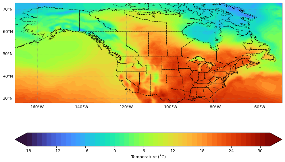
# Define the color range.
vmin, vmax = -18, 32
levels = 50
level_boundaries = np.linspace(vmin, vmax, levels + 1)

# Create the figure and axes.
projection = ccrs.PlateCarree()
fig, ax = plt.subplots(figsize=(12, 9), subplot_kw={"projection": projection})

# Plot the data.
_contourf = ax.contourf(
    gridded_lon,
    gridded_lat,
    temperature_array_celsius[0, :, :],
    cmap="turbo",
    transform=projection,
    levels=level_boundaries,
    vmin=vmin,
    vmax=vmax,
    extend="both",
)

# Make it nice.
plt.colorbar(
    _contourf,
    ticks=range(int(np.floor(vmin)), int(np.ceil(vmax + 1)), 6),
    boundaries=level_boundaries,
    values=(level_boundaries[:-1] + level_boundaries[1:]) / 2,
    orientation="horizontal",
    label="Temperature (˚C)",
    ax=ax,
)
ax.add_feature(cfeature.STATES, linestyle="--", linewidth=0.8, edgecolor="k")
ax.gridlines(
    crs=projection,
    draw_labels=["left", "bottom"],
    linewidth=0.8,
    color="gray",
    alpha=0.5,
    linestyle=":",
)

# Explicitly tell matplotlib to show the figure here.
plt.show()