Analysis#
The following section will provide information on determining if the information provided by UQPCE indicates if the surrogate model is a good fit for the data or not.
Diagnostic Plots#
This section will cover the diagnostic plots that are generated when the --plot flag is used. These can be helpful for determining if the surrogate model accurately represents the underlying response.
Note
Every data set is different and there are multiple diagnostic criteria and associated best practices for surrogate model adequacy checking. Ultimately, it is up to the subject matter expert to determine the suitability of the surrogate model. When in doubt, consult reference material or uncertainty quantification subject matter experts.
The NACA 0012 airfoil case with using order = 1 will be discussed. Using order = 1, the model has a mean of 0.21876, variance of 1.4897e-4, and confidence interval of [0.18703, 0.2493]. These are consistent with the expected output for this case. Using the --plot flag, diagnostic plots for the model are generated and shown below.
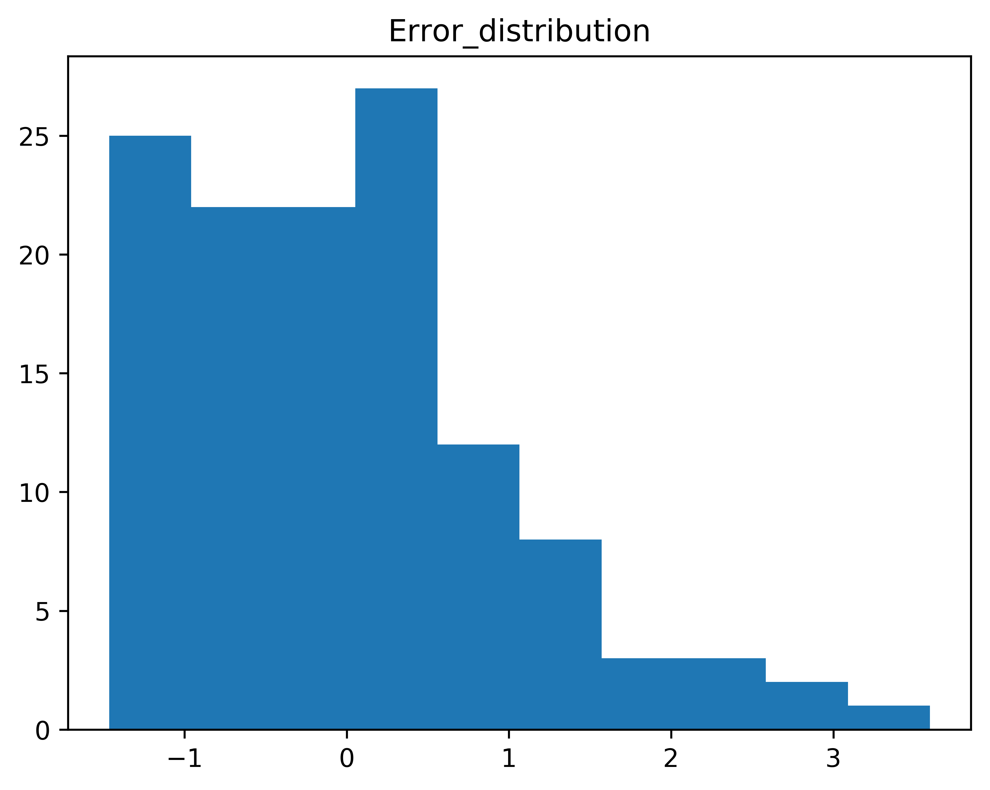
Fig. 2 A histogram of the error values from the model.#
This plot shows the error trending to the positive x-axis more than the negative. A normal distribution is expected for the error, and the distribution shown in the above figure suggests that the model does not accurately represent the underlying response.
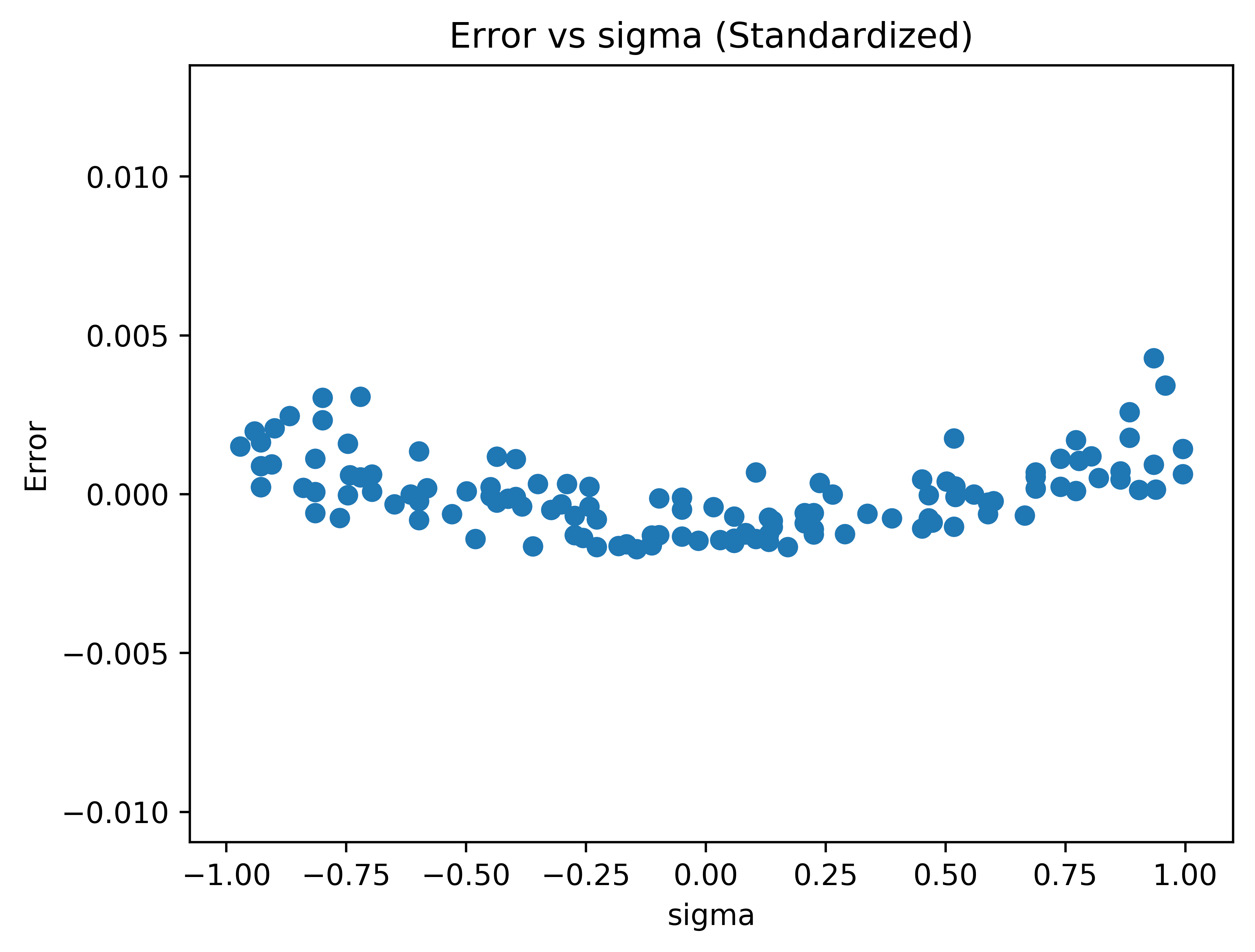
Fig. 3 The error versus sigma plot.#
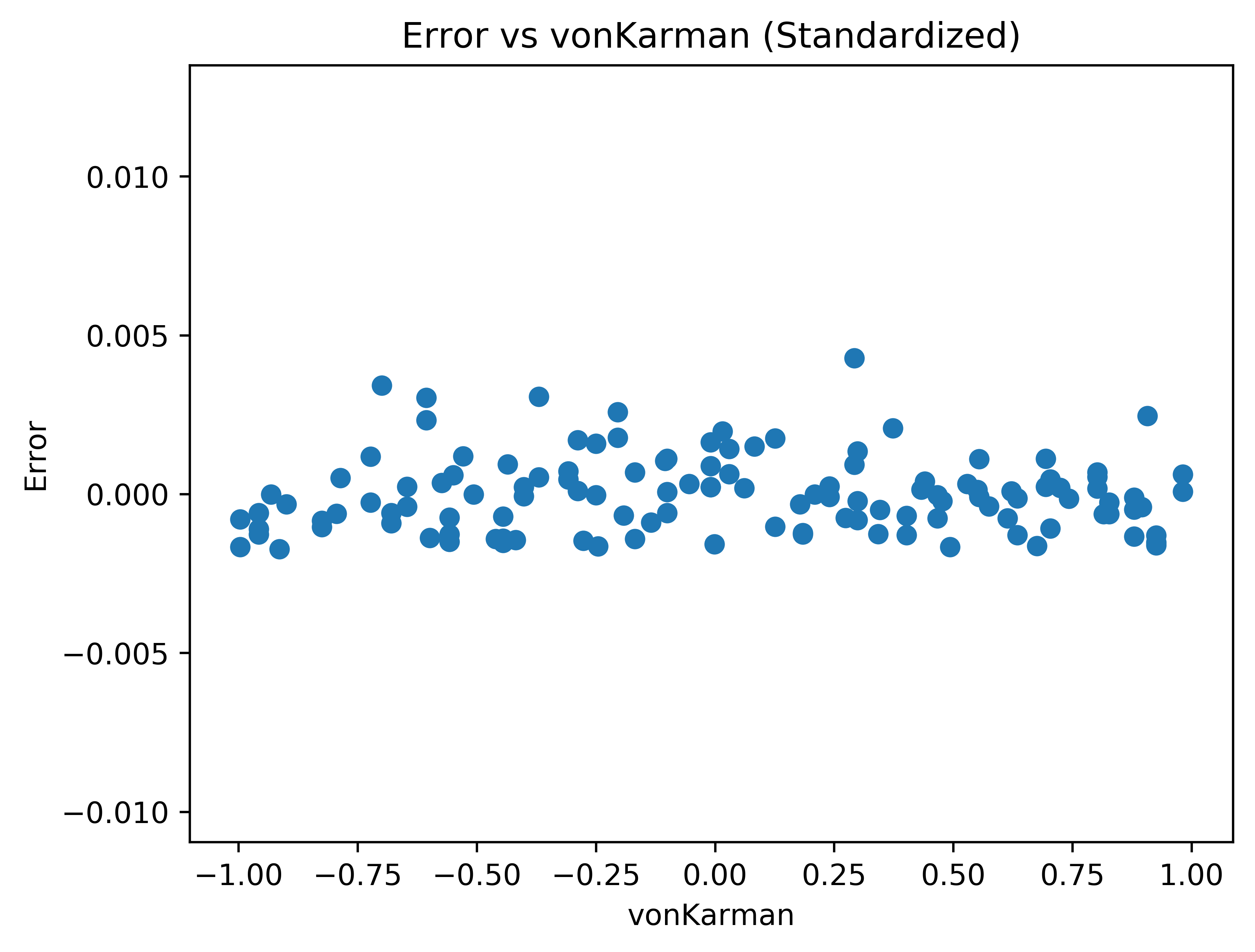
Fig. 4 The error versus von Karman plot.#
Next are the plots of error versus the variable values.
The von Karman constant doesn’t appear to have any correlation with error. However, the error versus sigma plot has a strong trend. This suggests that the model does not accurately represent the underlying response.
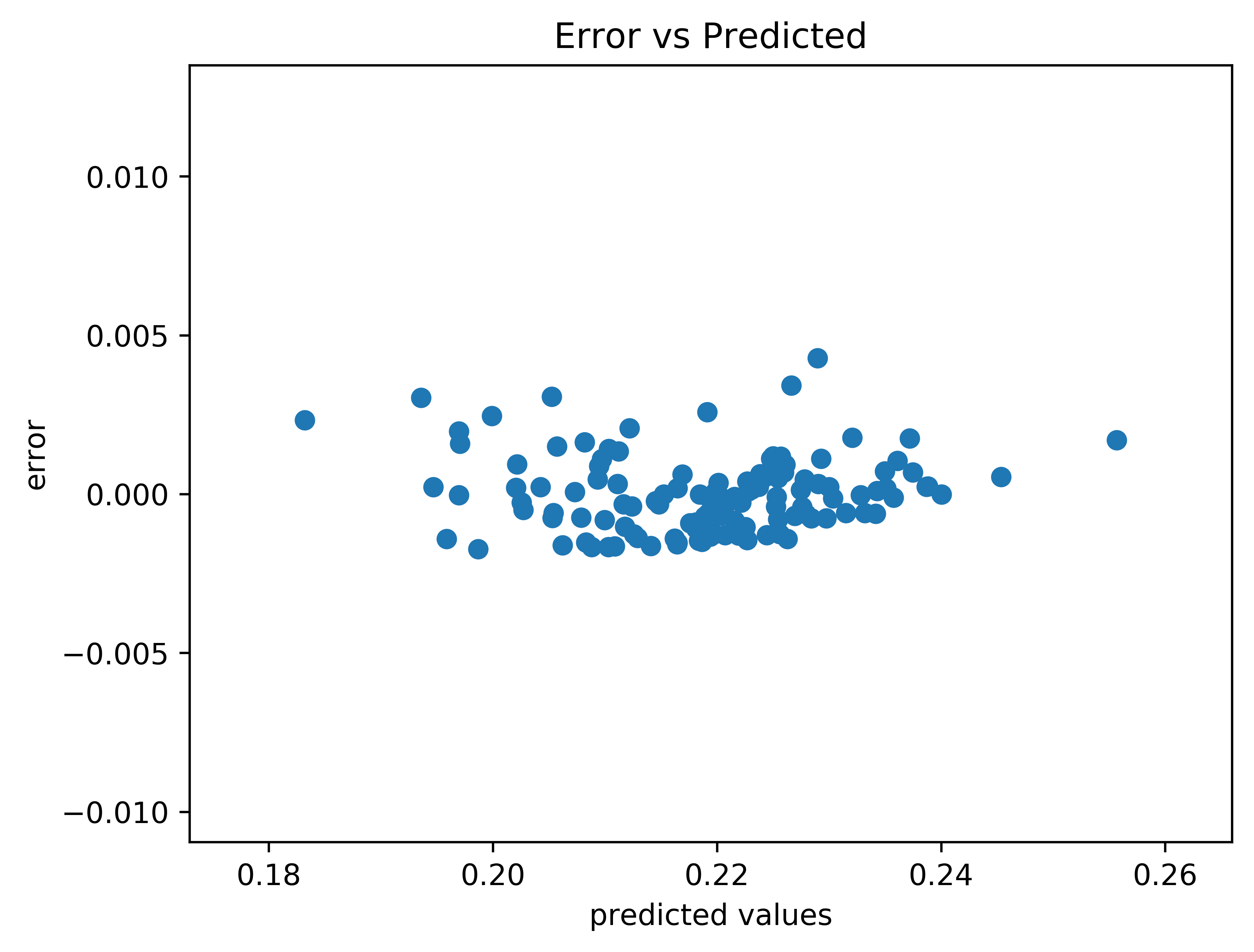
Fig. 5 The error versus the values predicted by the surrogate model.#
There is a similar trend in the error versus predicted values.
Note
The lowest order expansion that accurately models the underlying response should be used. Although higher order expansions can appear to result in better model fit, they can add spurious high frequency content.
Probability Box#
The probability box represents the generated results from the model during the resampling of the surrogate model. The results generated from the model for a set of random inputs is sorted to form a curve (or curves). The curves are interpolated to find the values that correspond to the significance (default : 0.05) of the confidence interval. If more than one curve is present, the lowest low confidence interval and highest high confidence interval are taken to be the overall confidence interval of the system.
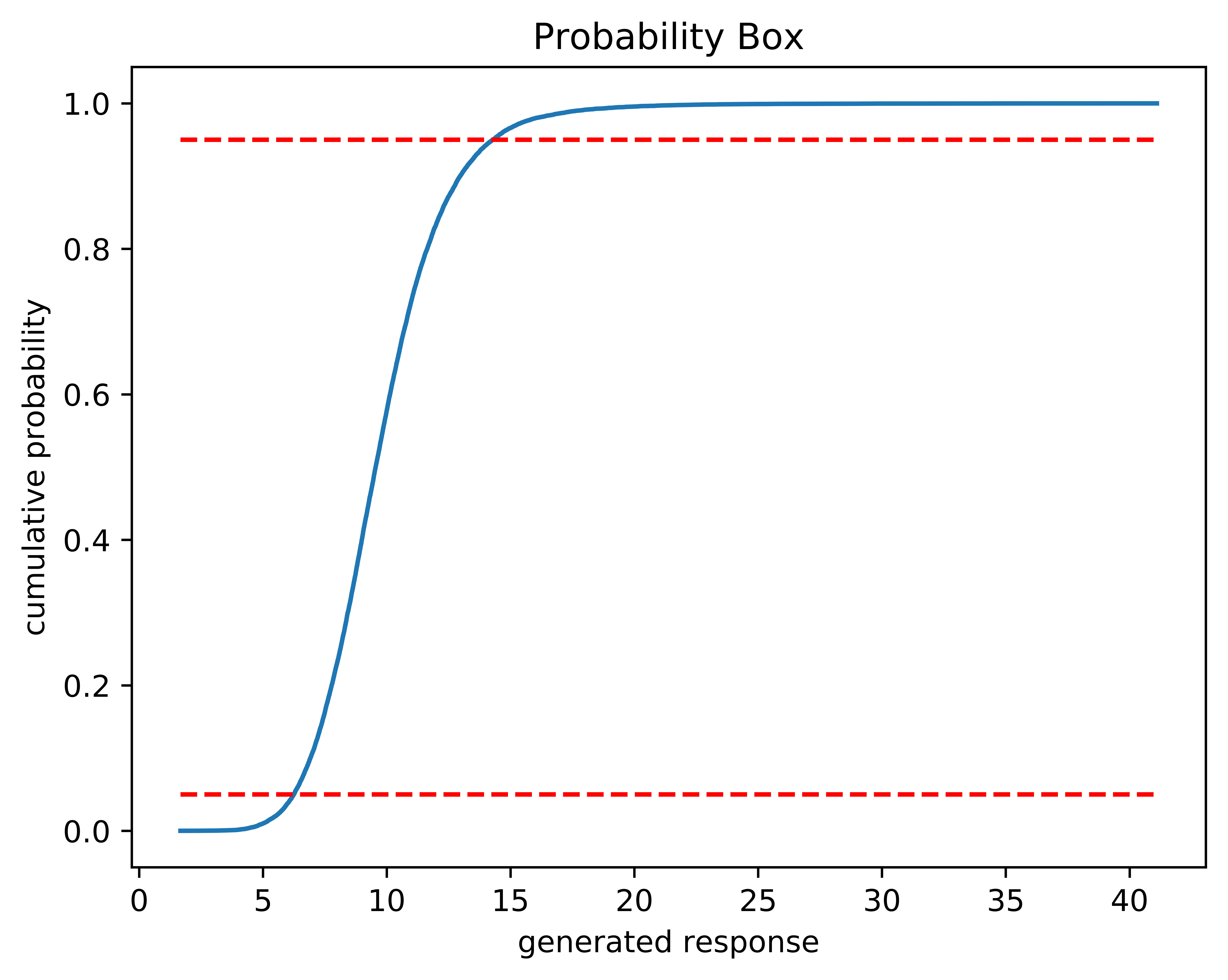
Fig. 6 An example of the 95% confidence interval on a probability box plot#
In the above figure, the dashed red lines represent where on the curve the values are taken to be used at the 95% confidence interval for this probability box.
Confidence Intervals#
In the case of a response that is strongly dependent on a gamma variable, the confidence interval may be less accurate due to rapid increase in the responses at the tail end. This is not a problem with the method. If the user notices this, they may want to increase both the number of the sample sizes and corresponding sub-sample sizes and/or reduce the convergence threshold percent. An example of a response that does this is shown below.
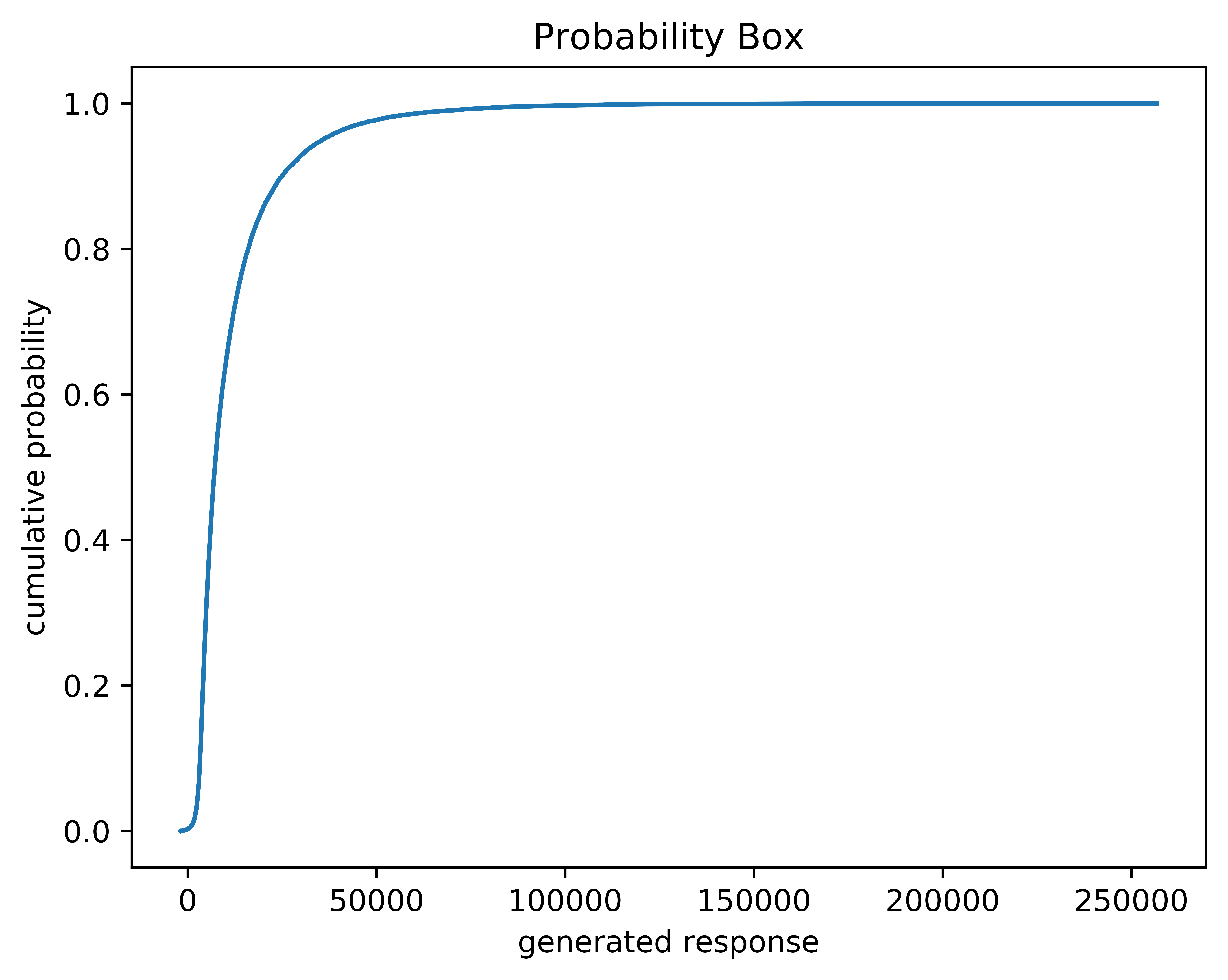
Fig. 7 A probability box for a gamma-heavy response.#
High-Order Polynomials#
For the purposes of this code, 5th order and higher is considered high-order. UQPCE has been tested up to 5th order, and it is not advised to use it for an order higher than this.
Introducing high-order terms can lead to overfitting the model. Even in instances where there are high-order interactions present, the statistics can be inaccurate if a majority of a 5th order interaction is captured by 1st, 2nd, 3rd, and 4th order terms. This makes it essential to look over the diagnostic plots, error distribution plots, and error statistics.
Below is an example of how this happens in a UQPCE model. The figure below shows a 5th order response using the equation \(((0.1)\ \frac{1}{4}e^{-\frac{(x-3)}{4}})^5\).
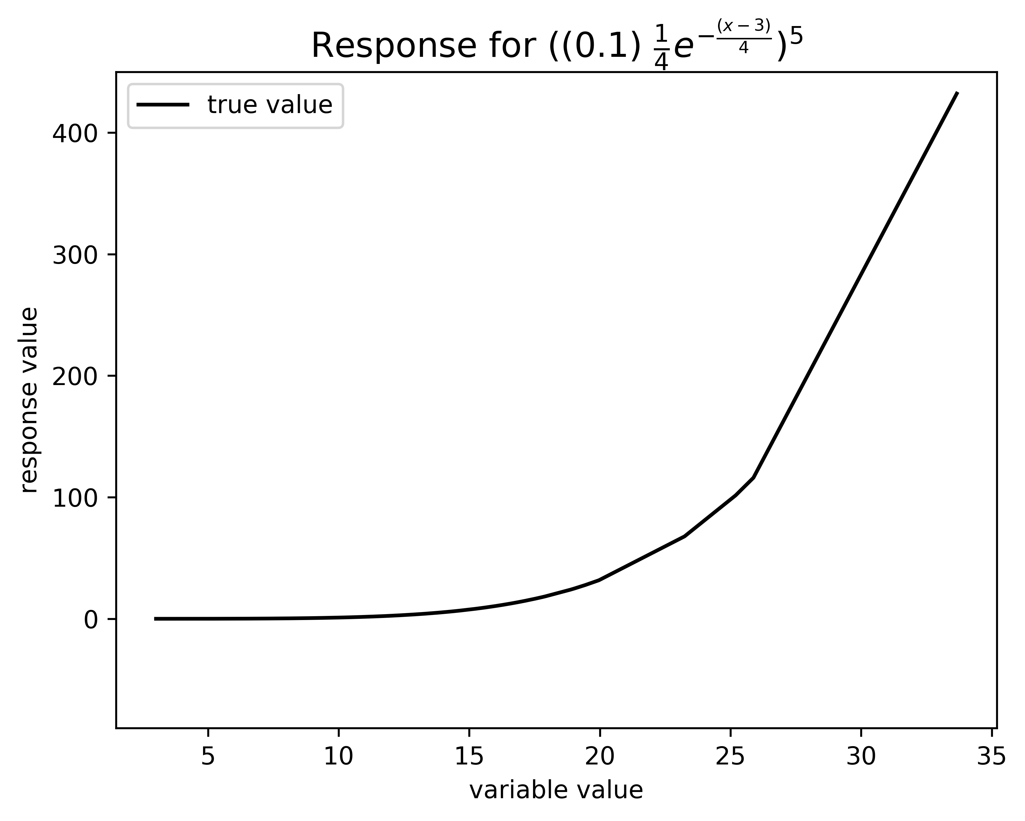
Fig. 8 The response for the given 5th order interaction.#
Below shows how UQPCE approximates this in the model. Most of this response will be attributed to the lower-order polynomials.
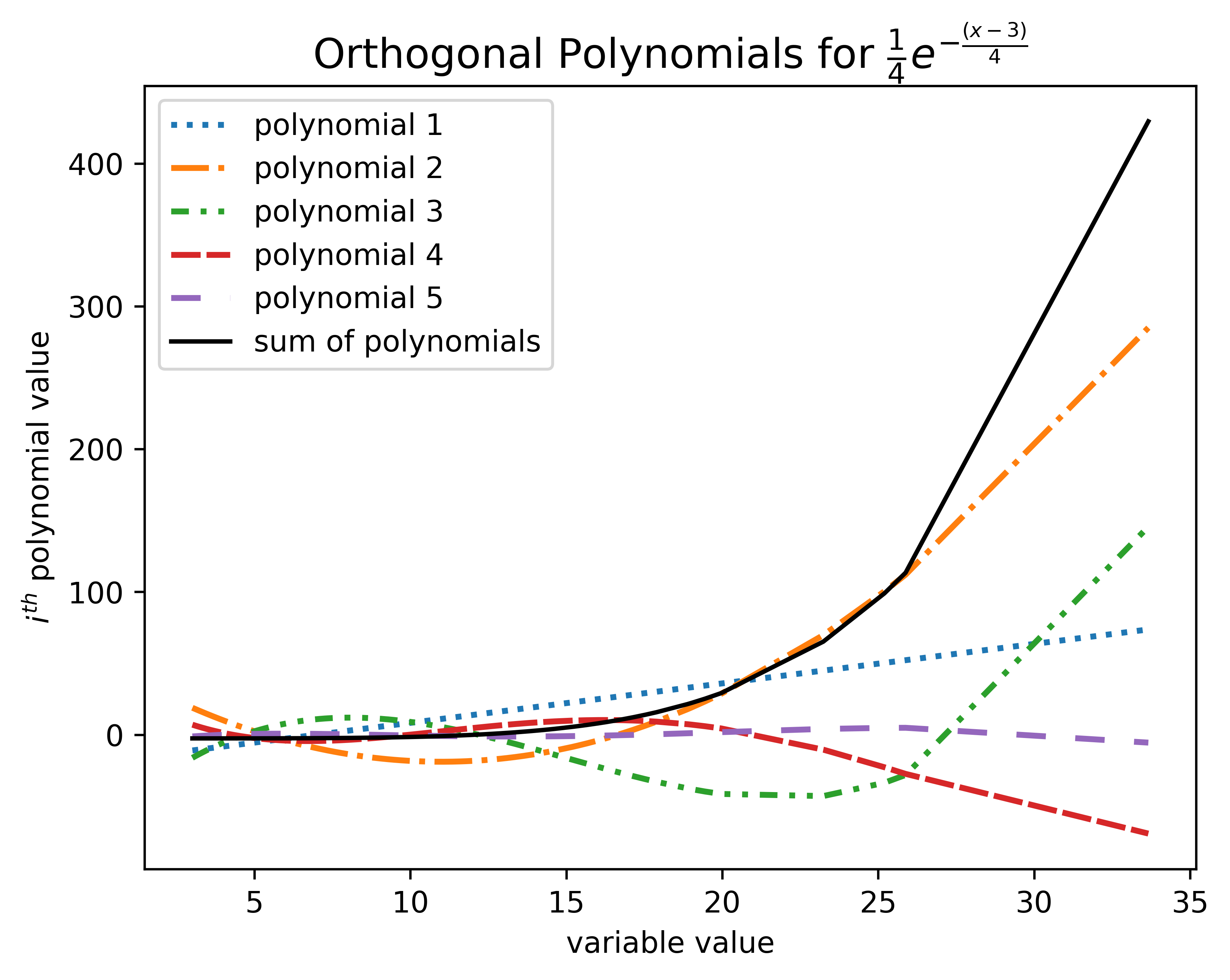
Fig. 9 The UQPCE surrogate model representation of the response.#
The orthogonal polynomials with the \(x_0\) values plugged in and multiplied by the matrix coefficients. The various dashed lines represent the orthogonal polynomials for orders 1 to 5, and the solid black line represents the sum of all of the dashed lines.
As shown in the images above, the sum of the lower terms in addition to the higher order terms is a convincing representation of the response. With that said, the coefficients and Sobol indices will suggest that \(x_0\), \(x_0^2\), \(x_0^3\), and \(x_0^4\) have a stronger influence on the response than \(x_0^5\). Note that the polynomial for \(x_0^5\), represented by the loosely dashed purple line, has a small magnitude overall.
In this particular example, the model statistics are adequate compared to the Monte Carlo method; however, this is not always the case. Refer to the diagnostic plots section for additional guidance. This is why using a lower-order model is preferable and referring to the included statistics and plots is recommended.
Normal Probability Plot#
The normal probability plot is another technique to determine if the model error is normally distributed. Also known as the “fat pencil test,” the normal probability plot should have the blue data points laying closely to the red line, such that all points would be covered if the red line were traced with a “fat pencil.”
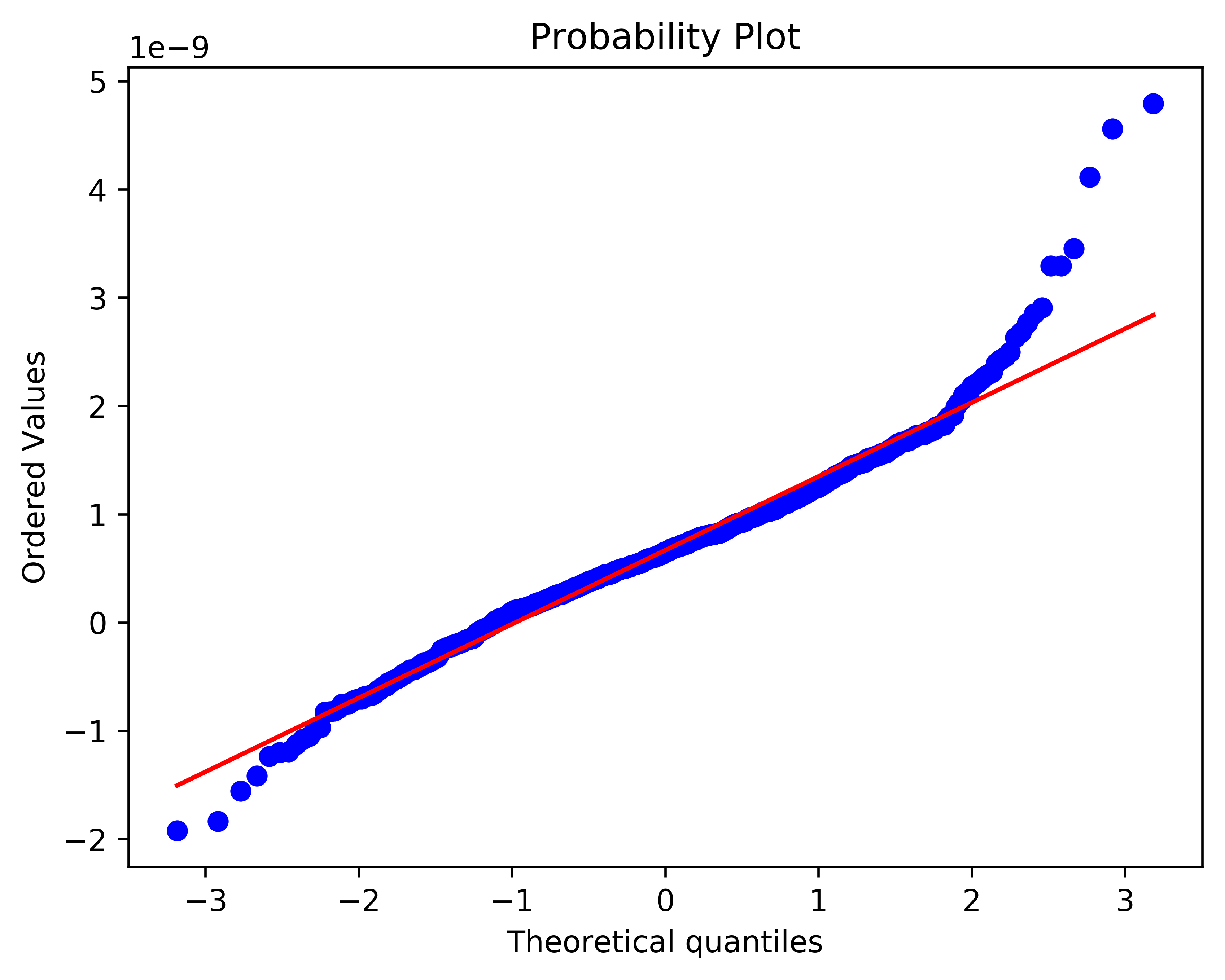
Fig. 10 A normal probability plot.#
In the image above, most of the points fall along the red line. However, the points on the right-most side of the figure stray far from the red line. This is an indication that the model may not be adequate for the data.