# Some cells may generate warnings that we can ignore. Comment below lines to see.
import warnings
warnings.filterwarnings('ignore')

import os
from os.path import join, expanduser, splitext, basename
import numpy as np
import pandas as pd
import geopandas as gpd
from osgeo import gdal
import rasterio as rio
import rioxarray as rxr
import holoviews as hv
import hvplot.xarray
import hvplot.pandas
import geoviews as gv
import earthaccess
import seaborn as sns
import matplotlib.pyplot as plt
from matplotlib.colors import LinearSegmentedColormap

from holoviews.streams import SingleTap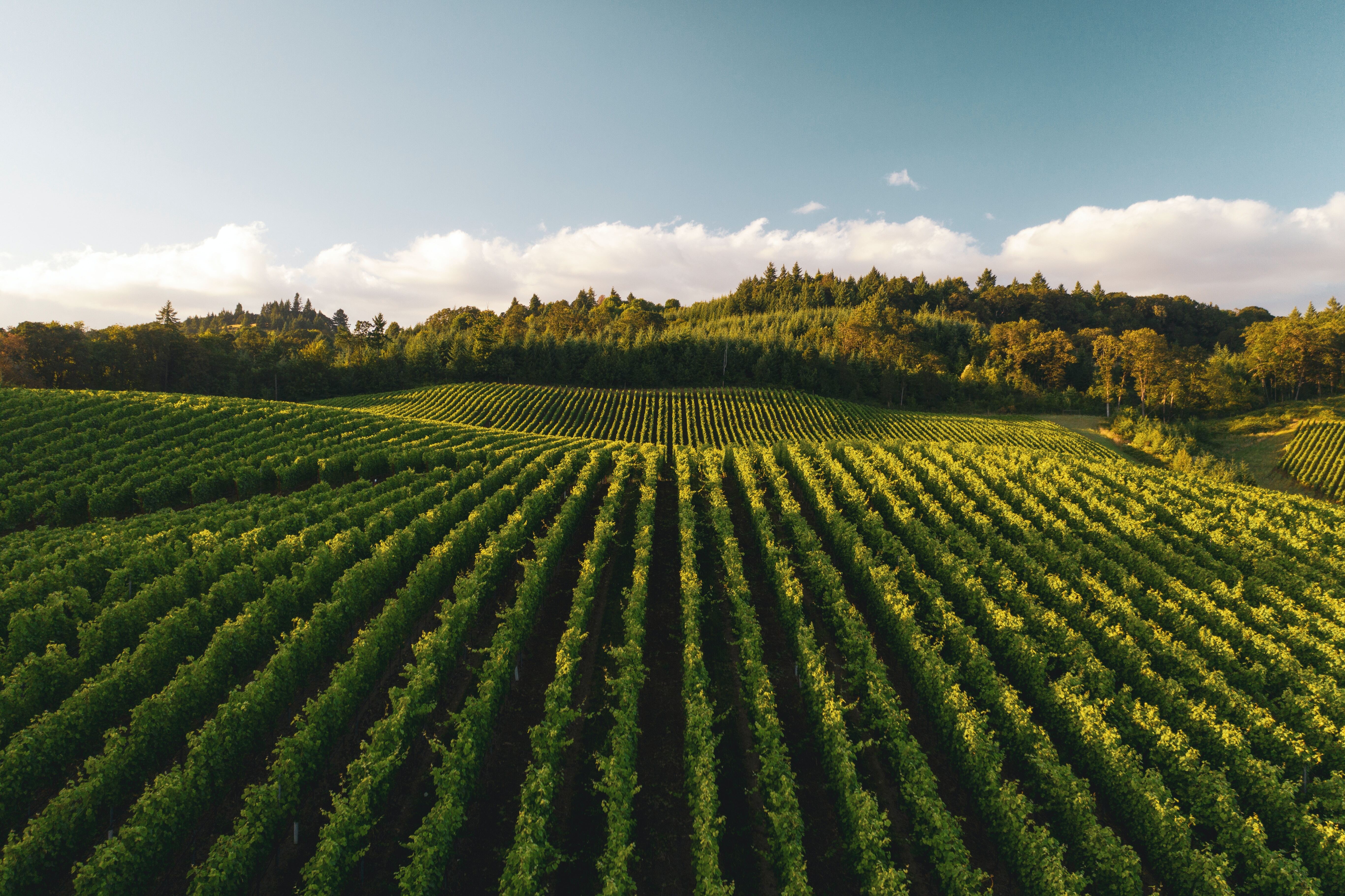
from scipy.stats import linregressSanta Barbara County Vineyards Analysis 2023
This notebook is part of a numbered series (01-05) that focuses specifically on using EMIT and ECOSTRESS Data together to prepare for future SBG research.
Authors:
Gregory Halverson and Claire Villanueva-Weeks
Jet Propulsion Laboratory, California Institute of Technology
This research was carried out at the Jet Propulsion Laboratory, California Institute of Technology, and was sponsored by ECOSTRESS and the National Aeronautics and Space Administration (80NM0018D0004).
© 2023. All rights reserved.
Summary and Background
Santa Barbara County is a well-known for its viticulture. Positioned near the ocean, the unique topography of Santa Barbara allows for unique microclimates that yield diverse crops and wines. In this notebook, we aim to visualize and analyze Vineyard health using Earth observation data from two different satellite products: the EMIT L2A Reflectance product stored in NETCDF4 format and an ECOSTRESS L2 Land Surface Temperature product stored in GEOTIFF format. Our goal is to visualize Normalized Difference Vegetation Index (NDVI), Equivalent Water Thickness (EWT), Evapotranspiration (ET), and Surface Temperature (ST) interactively in holoviews maps and generate linear regression plots of point source data.
Requirements
- NASA Earthdata Account
- No Python setup requirements if connected to the workshop cloud instance!
- Local Only Set up Python Environment - See setup_instructions.md in the
/setup/folder to set up a local compatible Python environment
- Downloaded necessary files. This is done at the end of the 01_Finding_Concurrent_Data notebook.
Tutorial references
01_Finding_Concurrent_Data.ipynb - Finding and downloading concurrent EMIT and ECOSTRESS data with earthaccess
03_EMIT_CWC_from_Reflectance.ipynb - Calculating EWT of ROI
03_EMIT_Inreractive_Points.ipynb - Generating a map with clickable points
Required datasets
- EMIT Reflectance
- EMIT_L2A_RFL_001_20230401T203803_2309114_003.nc
- EMIT Canopy Water Content
- EMIT_L2A_RFL_001_20230401T203751_2309114_002_roi_bbox_cwc_merged.tif
- ECOSTRESS Land Surface Temperature
- ECOv002_L2T_LSTE_26860_001_10SGD_20230401T203733_0710_01_LST.tif
- ECOSTRESS Evapotranspiration
- ECOv002_L3T_JET_26860_001_10SGD_20230401T203732_0700_01_ETdaily.tif
- SB_ROI_ag.geojson: This file includes polygons of delineated agricultural field boundaries. It has been clipped to our ROI and fields were edited for ease of usability.
Tutorial Outline
5.1 Set up
5.2 Locating Data Sources and Loading Data
5.3 Color Hex-Codes for Raster Plots
5.4 Subsetting the data over our ROI
5.5 Interactive Maps
5.6 Scatter Plots
References
- Jackson, M. (2018). Santa Barbara County (Images of America). Arcadia Publishing.
- CalAgData
5.1 Set up
These are some built-in Python functions we need for this notebook, including functions for handling filenames and dates.
We’re using the rioxarray package for loading raster data from a GeoTIFF file, and we’re importing it as rxr. We’re using the numpy library to handle arrays, and we’re importing it as np. We’re using the rasterio package to subset the data.
We’re using the geopandas library to load vector data from GeoJSON files, and we’re importing it as gpd. We’re using the shapely library to handle vector data and the pyproj library to handle projections.
Import the emit_tools module and call use from emit_tools import emit_xarray help(emit_xarray) the help function to see how it can be used.
Note: This function currently works with L1B Radiance and L2A Reflectance Data.
Importing Custom EMIT Tools to handle the EMIT reflectance data
from modules.emit_tools import emit_xarray, ortho_xrWe can define these constants to prescribe the dimensions of our figures. Feel free to adjust these to fit your display. We’re setting the alpha to make the raster semi-transparent on top of the basemap.
FIG_WIDTH_PX = 1080
FIG_HEIGHT_PX = 720
FIG_WIDTH_IN = 16
FIG_HEIGHT_IN = 9
FIG_ALPHA = 0.7
BASEMAP = "EsriImagery"
SEABORN_STYLE = "whitegrid"
FILL_COLOR = "none"
LINE_COLOR = "red"
LINE_WIDTH = 3
WEBMAP_PROJECTION = "EPSG:4326"
sns.set_style(SEABORN_STYLE)
5.2 Locating Data Sources and Loading Data
Here we are defining location of EMIT and ECOSTRESS raster files.
data_dir = "../data/"
data_dir
Here we are loading in our vector data source. We can image the delineated agricultural field boundaries and take a look at the fields.
ag_file = join(data_dir,"SB_ROI_ag.geojson")
# cut out the agroi section
ag_latlon = gpd.read_file(ag_file)

ag_fig = ag_latlon.to_crs(WEBMAP_PROJECTION).hvplot.polygons(
    tiles=BASEMAP,
    line_color = LINE_COLOR,
    line_width = LINE_WIDTH,
    fill_color = FILL_COLOR,
    crs='EPSG:4326'
)

ag_figag_latlonLoading in EMIT reflectance data
This notebook requires downloading an EMIT scene if this was not done in a previous notebook.
# Get requests https Session using Earthdata Login Info
url = 'https://data.lpdaac.earthdatacloud.nasa.gov/lp-prod-protected/EMITL2ARFL.001/EMIT_L2A_RFL_001_20230401T203803_2309114_003/EMIT_L2A_RFL_001_20230401T203803_2309114_003.nc'
fs = earthaccess.get_requests_https_session()
# Retrieve granule asset ID from URL (to maintain existing naming convention)
granule_asset_id = url.split('/')[-1]
# Define Local Filepath
fp = join(data_dir, granule_asset_id)
# Download the Granule Asset if it doesn't exist
if not os.path.isfile(fp):
    with fs.get(url,stream=True) as src:
        with open(fp,'wb') as dst:
            for chunk in src.iter_content(chunk_size=64*1024*1024):
                dst.write(chunk)
To open up the EMIT .nc file we will use the netCDF4, xarray and emit_tools libraries.
EMIT_fp = join(data_dir, "EMIT_L2A_RFL_001_20230401T203803_2309114_003.nc")
EMIT_fp
refl_ds = emit_xarray(EMIT_fp, ortho=True)
refl_dsHere some functions are set up to
5.3 Color Hex-Codes for Raster Plots
Here we have set up convenience functions for interpolating Color Hex-Codes for Raster Plots
def interpolate_hex(hex1, hex2, ratio):
    rgb1 = [int(hex1[i:i+2], 16) for i in (1, 3, 5)]
    rgb2 = [int(hex2[i:i+2], 16) for i in (1, 3, 5)]
    rgb = [int(rgb1[i] + (rgb2[i] - rgb1[i]) * ratio) for i in range(3)]

    return '#{:02x}{:02x}{:02x}'.format(*rgb)

def create_gradient(colors, steps):
    gradient = []

    for i in range(len(colors) - 1):
        for j in range(steps):
            ratio = j / float(steps)
            gradient.append(interpolate_hex(colors[i], colors[i+1], ratio))

    gradient.append(colors[-1])

    return gradient

def plot_cmap(cmap):
    gradient = np.linspace(0, 1, 256)  # Gradient from 0 to 1
    gradient = np.vstack((gradient, gradient))  # Make 2D image

    # Display the colormap
    plt.figure(figsize=(6, 2))
    plt.imshow(gradient, aspect='auto', cmap=cmap)
    plt.axis('off')
    plt.show()
Near-Infrared and Red Bands in EMIT Hyperspectral Cube
These are the nearest to 800 nm and 675 nm wavelengths, they can be used to calculate the NDVI using a ratio of the difference between the wavelengths to the sum of the wavelengths. NDVI is a metric by which we can estimate vegetation greenness.
The hvplot package extends xarray to allow us to plot maps. We’re reprojecting the raster geographic projection EPSG 4326 to overlay on the basemap with a latitude and longitude graticule. We will be using hvplot a few more times to look at the data we are using.
Defining Color-Map for Near Infrared
NIR_colors = ["#000000", "#FF0000"]
NIR_gradient = create_gradient(NIR_colors, 100)
NIR_cmap = LinearSegmentedColormap.from_list(name="NIR", colors=NIR_colors)
plot_cmap(NIR_cmap)
Extracting 800 nm Near Infrared from EMIT
NIR = refl_ds.sel(wavelengths=800, method="nearest")
NIR.rio.to_raster(join(data_dir,"NIR_800.tif"))
NIR = rxr.open_rasterio(join(data_dir,"NIR_800.tif"), mask_and_scale=True).squeeze("band", drop=True)
NIR.data[NIR.data==-9999] = np.nan
NIR_vmin, NIR_vmax = np.nanquantile(np.array(NIR), [0.02, 0.98])
NIR_title = f"{splitext(basename(EMIT_fp))[0]} ~800 nm"

NIR.rio.reproject(WEBMAP_PROJECTION).hvplot.image(
    crs=WEBMAP_PROJECTION,
    cmap=NIR_gradient,
    alpha=FIG_ALPHA,
    tiles=BASEMAP,
    clim=(NIR_vmin, NIR_vmax),
    title=NIR_title
)
Defining Color-Map for Red
red_colors = ["#000000", "#FF0000"]
red_gradient = create_gradient(red_colors, 100)
red_cmap = LinearSegmentedColormap.from_list(name="red", colors=red_colors)
plot_cmap(red_cmap)
Extracting 675 nm Red from EMIT
red = refl_ds.sel(wavelengths=675, method="nearest")
red.rio.to_raster(join(data_dir,"red_675.tif"))
red = rxr.open_rasterio(join(data_dir,"red_675.tif")).squeeze("band", drop=True)
red.data[red.data==-9999] = np.nan
red_vmin, red_vmax = np.nanquantile(np.array(red), [0.02, 0.98])
red_title = f"{splitext(basename(EMIT_fp))[0]} ~675 nm"

red.rio.reproject(WEBMAP_PROJECTION).hvplot.image(
    crs=WEBMAP_PROJECTION,
    cmap=red_gradient,
    alpha=FIG_ALPHA,
    tiles=BASEMAP,
    clim=(red_vmin, red_vmax),
    title=red_title
)
Defining Color-Map for Vegetation Index
NDVI_colors=[
    "#0000ff",
    "#000000",
    "#745d1a",
    "#e1dea2",
    "#45ff01",
    "#325e32"
]

NDVI_gradient = create_gradient(NDVI_colors, 100)
NDVI_cmap = LinearSegmentedColormap.from_list(name="NDVI", colors=NDVI_colors)
plot_cmap(NDVI_cmap)
Calculating Vegetation Index
NDVI = (NIR - red)/(NIR + red)
NDVI.rio.to_raster(join(data_dir,"NDVI.tif"))
NDVI = rxr.open_rasterio(join(data_dir,"NDVI.tif")).squeeze("band", drop=True)
NDVI_vmin, NDVI_vmax = np.nanquantile(np.array(NDVI), [0.02, 0.98])
NDVI_title = "Normalized Difference Vegetation Index"

NDVI_scene_map = NDVI.rio.reproject(WEBMAP_PROJECTION).hvplot.image(
    crs=WEBMAP_PROJECTION,
    cmap=NDVI_gradient,
    alpha=FIG_ALPHA,
    tiles=BASEMAP,
    clim=(NDVI_vmin, NDVI_vmax),
    title=NDVI_title
)

NDVI_scene_map
Loading in and visualizing our EWT data
We can now open up the EWT data that you calculated earlier with the LP DAAC EWT. The dataset is now in .tif format which means we can just open this one up
EWT_filename = join(data_dir,'EMIT_L2A_RFL_001_20230401T203751_2309114_002_roi_bbox_cwc_merged.tif')
EWT_filename
Defining Color-Map for EWT
EWT_colors = ["#FFFFFF", "#0000FF"]
EWT_gradient = create_gradient(EWT_colors, 100)
EWT_cmap = LinearSegmentedColormap.from_list(name="EWT", colors=EWT_colors)
plot_cmap(EWT_cmap)
Mapping EWT with color ramp
EWT = rxr.open_rasterio(EWT_filename).squeeze("band", drop=True)
EWT_vmin, EWT_vmax = np.nanquantile(np.array(EWT), [0.02, 0.98])
EWT_title = "Equivalent Water Thickness "

EWT.rio.reproject(WEBMAP_PROJECTION,nodata=np.nan).hvplot.image(
    crs=WEBMAP_PROJECTION,
    cmap=EWT_gradient,
    alpha=FIG_ALPHA,
    tiles=BASEMAP,
    clim=(EWT_vmin, EWT_vmax),
    title=EWT_title
)
Loading an ECOSTRESS LST granule
ST_filename = join(data_dir, "ECOv002_L2T_LSTE_26860_001_10SGD_20230401T203733_0710_01_LST.tif")
ST_filename
The temperatures in the L2T_LSTE product are given in Kelvin. To convert them to Celsius, we subtract 273.15.
ST_K = rxr.open_rasterio(ST_filename).squeeze('band', drop=True)
ST_C = ST_K - 273.15

ST_C.rio.to_raster(join(data_dir,"ST.tif"))

ST_vmin, ST_vmax = np.nanquantile(np.array(ST_C), [0.02, 0.98])
ST_title = "ECOSTRESS Surface Temperature (Celsius)"

ST_C.rio.reproject(WEBMAP_PROJECTION,nodata=np.nan).hvplot.image(
    crs=WEBMAP_PROJECTION,
    cmap="jet",
    alpha=FIG_ALPHA,
    tiles=BASEMAP,
    clim=(ST_vmin, ST_vmax),
    title=ST_title
)
Defining Color Ramps
Color ramps or maps, are used to map valued over a range of colors based on the data and goals of visualization. Here we show how to create a custom color ramp for the data using hex codes. The examples shown are red-green colorblind friendly.
ST_colors = [
    "#054fb9",
    "#0073e6",
    "#8babf1",
    "#cccccc",
    "#e1ad01",
    "#f57600",
    "#c44601"
]

ST_gradient = create_gradient(ST_colors, 100)
ST_cmap = LinearSegmentedColormap.from_list(name="ST", colors=ST_colors)
plot_cmap(ST_cmap)
ST_vmin, ST_vmax = np.nanquantile(np.array(ST_C), [0.02, 0.98])
ST_title = "ECOSTRESS Surface Temperature (Celsius)"
ST_C.rio.reproject(WEBMAP_PROJECTION).hvplot.image(
crs=WEBMAP_PROJECTION,
cmap=ST_gradient,
alpha=FIG_ALPHA,
tiles=BASEMAP,
clim=(ST_vmin, ST_vmax),
title=ST_title
)Loading ECOSTRESS Evapotranspiration granule
ET_filename = join(data_dir, "ECOv002_L3T_JET_26860_001_10SGD_20230401T203732_0700_01_ETdaily.tif")
ET_filename
Now create a color ramp representing ECOSTRESS evapotranspiration.
ET_colors = [
    "#f6e8c3",
    "#d8b365",
    "#99974a",
    "#53792d",
    "#6bdfd2",
    "#1839c5"
]

ET_gradient = create_gradient(ET_colors, 100)
ET_cmap = LinearSegmentedColormap.from_list(name="ET", colors=ET_colors)
plot_cmap(ET_cmap)
The daily evapotranspiration product from ECOSTRESS is given in millimeters per day.
ET = rxr.open_rasterio(ET_filename).squeeze('band', drop=True)
ET_vmin, ET_vmax = np.nanquantile(np.array(ET), [0.02, 0.98])
ET_title = "ECOSTRESS Evapotranspiration (mm / day)"

ET.rio.reproject(WEBMAP_PROJECTION).hvplot.image(
    crs=WEBMAP_PROJECTION,
    cmap=ET_gradient,
    alpha=FIG_ALPHA,
    tiles=BASEMAP,
    clim=(ET_vmin, ET_vmax),
    title=ET_title
)
5.4. Subsetting the data over our ROI
To clip the raster image to the extent of the vector dataset, we want to subset the raster to the bounds of the vector dataset. This dataset is included here in GeoJSON format, which we’ll load in as a geodataframe using the geopandas package.
The GeoJSON is provided by CalAg and includes information on agricultural field boundaries in the Santa Barbara County. We can use this code to select the largest polygons that are classified as vineyards.
Using the rioxarray clip function, we can subset the data using a geojson. to visualize the area that are vineyards are located, I have selected a boundary polygon. Overlaid are the outlines of some of the larger vineyards in the scene.
target_text = 'WINE'

filtered_gdf = ag_latlon[ag_latlon['crop_list'].str.contains(target_text, case=False, na=False)]

Q1 = filtered_gdf['size'].quantile(0.25)
Q3 = filtered_gdf['size'].quantile(0.75)
IQR = Q3 - Q1

# Define the threshold as Q3 + 1.5 * IQR (adjust multiplier as needed)
threshold_size = Q3 + 1.5 * IQR

# Filter polygons based on size greater than the threshold
vineyard_polygons = filtered_gdf[filtered_gdf['size'] > threshold_size]
vineyard_polygons
vineyard_plot = vineyard_polygons.to_crs("EPSG:4326").hvplot.polygons(
crs=WEBMAP_PROJECTION,
tiles=BASEMAP,
alpha=FIG_ALPHA,
width=FIG_WIDTH_PX,
height=FIG_HEIGHT_PX,
fill_color = 'none',
line_color = 'r',
line_width = 3,
title="Vineyards of Acreage greater than IQR3",
fontscale=1.5
)
hv.extension('bokeh')
vineyard_plotInteractively mapping our data
Now that we have selected a subset of the agriculture in the area we can subset our data using the rioxarray function clip.
NDVI_vineyard = NDVI.rio.clip(vineyard_polygons.geometry.values,vineyard_polygons.crs, all_touched=True)
NDVI_vineyard.rio.to_raster(join(data_dir,"NDVI_vineyard.tif"))
NDVI_vineyard = rxr.open_rasterio(join(data_dir,"NDVI_vineyard.tif")).squeeze("band", drop=True)
NDVI_vmin, NDVI_vmax = np.nanquantile(np.array(NDVI_vineyard), [0.02, 0.98])

ST_vineyard = ST_C.rio.clip(vineyard_polygons.geometry.values,vineyard_polygons.crs, all_touched=True)
ST_vineyard.rio.to_raster(join(data_dir,"ST_vineyard.tif"))
ST_vineyard = rxr.open_rasterio(join(data_dir,"ST_vineyard.tif")).squeeze("band", drop=True)
ST_vmin, ST_vmax = np.nanquantile(np.array(ST_vineyard), [0.02, 0.98])

EWT_vineyard = EWT.rio.clip(vineyard_polygons.geometry.values,vineyard_polygons.crs, all_touched=True)
EWT_vineyard.rio.to_raster(join(data_dir,"EWT_vineyard.tif"))
EWT_vineyard = rxr.open_rasterio(join(data_dir,"EWT_vineyard.tif")).squeeze("band", drop=True)
EWT_vmin, EWT_vmax = np.nanquantile(np.array(EWT_vineyard), [0.02, 0.98])

ET_vineyard = ET.rio.clip(vineyard_polygons.geometry.values,vineyard_polygons.crs, all_touched=True)
ET_vineyard.rio.to_raster(join(data_dir,"ET_vineyard.tif"))
ET_vineyard = rxr.open_rasterio(join(data_dir,"ET_vineyard.tif")).squeeze("band", drop=True)
ET_vmin, ET_vmax = np.nanquantile(np.array(ET_vineyard), [0.02, 0.98])
5.5 Interactive Maps
We can use holoviews to plot an interactive clickable map of these subsets over our ROI. When you click a point on the map, you can see the coordinates and data for that pixel. You can uncomment the crs and tiles option lines below to visualize the data on a basemap, but this breaks thee interactive feature. Additionally, the interactive feature seems to also affect the color bar min and max limits (clim) whether applied manually or automatically. This may cause the color ramp to display incorrectly. Selecting and exporting values will work properly.
clicked_values = []

# Reproject raster data
NDVI_vineyard_projected = NDVI_vineyard.rio.reproject(WEBMAP_PROJECTION, nodata=np.nan)
ST_vineyard_projected = ST_vineyard.rio.reproject(WEBMAP_PROJECTION, nodata=np.nan)
EWT_vineyard_projected = EWT_vineyard.rio.reproject(WEBMAP_PROJECTION, nodata=np.nan)
ET_vineyard_projected = ET_vineyard.rio.reproject(WEBMAP_PROJECTION, nodata=np.nan)

# Load geospatial data
vineyard_polygons = gpd.read_file(join(data_dir,"vineyard_polygons_filtered.geojson"))

# Set up the SingleTap stream
stream = SingleTap()

# Define a function to process clicks
def interactive_click(x, y):
    if None not in [x, y]:
        NDVI_value = NDVI_vineyard_projected.sel(x=x, y=y, method="nearest").values
        ST_value = ST_vineyard_projected.sel(x=x, y=y, method="nearest").values
        ET_value = ET_vineyard_projected.sel(x=x, y=y, method="nearest").values
        EWT_value = EWT_vineyard_projected.sel(x=x, y=y, method="nearest").values
        print(f"Lon: {x}, Lat: {y}, NDVI: {NDVI_value}, ST: {ST_value}, EWT: {EWT_value}, ET: {ET_value}")
        clicked_values.append({ "Lon": x, "Lat": y, "NDVI": NDVI_value, "ST": ST_value, "ET": ET_value, "EWT": EWT_value})

    return hv.Points((x, y)).opts(color='green', size=10)

# Create two separate plots and share the stream between them
NDVI_vineyard_map = NDVI_vineyard_projected.hvplot.image(
    #crs=WEBMAP_PROJECTION,
    cmap=NDVI_gradient,
    clim=(NDVI_vmin, NDVI_vmax),
    alpha=FIG_ALPHA,
    #tiles=BASEMAP,
    title=NDVI_title
) * vineyard_polygons.to_crs(WEBMAP_PROJECTION).hvplot.polygons(
    #crs=WEBMAP_PROJECTION,
    line_color=LINE_COLOR,
    line_width=LINE_WIDTH,
    fill_color=FILL_COLOR
).opts(width=600, height=400, fontscale=1.5)

ST_vineyard_map = ST_vineyard_projected.hvplot.image(
    #crs=WEBMAP_PROJECTION,
    cmap=ST_gradient,
    #clim=(ST_vmin, ST_vmax),
    alpha=FIG_ALPHA,
    #tiles=BASEMAP,
    title=ST_title
) * vineyard_polygons.to_crs(WEBMAP_PROJECTION).hvplot.polygons(
    #crs=WEBMAP_PROJECTION,
    line_color=LINE_COLOR,
    line_width=LINE_WIDTH,
    fill_color=FILL_COLOR
).opts(width=600, height=400, fontscale=1.5)

# Duplicate the plots for the second row
EWT_vineyard_map = EWT_vineyard_projected.hvplot.image(
    #crs=WEBMAP_PROJECTION,
    cmap=EWT_gradient,
    #clim=(EWT_vmin, EWT_vmax),
    alpha=FIG_ALPHA,
    #tiles=BASEMAP,
    title=EWT_title
) * vineyard_polygons.to_crs(WEBMAP_PROJECTION).hvplot.polygons(
    #crs=WEBMAP_PROJECTION,
    line_color=LINE_COLOR,
    line_width=LINE_WIDTH,
    fill_color=FILL_COLOR
).opts(width=600, height=400, fontscale=1.5)

ET_vineyard_map = ET_vineyard_projected.hvplot.image(
    #crs=WEBMAP_PROJECTION,
    rasterize=True,
    cmap=ET_gradient,
    #clim=(ET_vmin, ET_vmax),
    alpha=FIG_ALPHA,
    #tiles=BASEMAP,
    title=ET_title
) * vineyard_polygons.to_crs(WEBMAP_PROJECTION).hvplot.polygons(
    #crs=WEBMAP_PROJECTION,
    line_color=LINE_COLOR,
    line_width=LINE_WIDTH,
    fill_color=FILL_COLOR
).opts(width=600, height=400, fontscale=1.5)

# Create a DynamicMap for interactive clicks
click = hv.DynamicMap(interactive_click, streams=[stream])

# Display the plots in a 2x2 grid with two rows along with the interactive click behavior
layout = (click * NDVI_vineyard_map * click + click * ST_vineyard_map * click +
          click * EWT_vineyard_map * click + click * ET_vineyard_map * click).cols(2)
layout
Save the data from our clicked points into a csv that we can use for plotting.
# Save the clicked values to a CSV file after all clicks are processed
if clicked_values:
    df = pd.DataFrame(clicked_values)
    df.to_csv(join(data_dir,"clicked_values.csv"), index=False)
    print("Clicked values saved to 'clicked_values.csv'")
else:
    print("No clicked values to save.")
5.6 Scatter Plots
Now we can use the data saved into our csv to create scatter plots to visualize the correlations among ET, ST, EWT, and NDVI.
# Replace "your_data.csv" with the actual CSV file containing your data
df = pd.read_csv(join(data_dir,"clicked_values.csv"))

# Filter out Lat/Lon Columns
filtered_columns = df.columns[2:]

# Get combinations of all pairs of columns
combinations = [(col1, col2) for i, col1 in enumerate(filtered_columns) for col2 in filtered_columns[i + 1:]]

# Set up subplots without equal aspect ratio and sharex/sharey set to False
fig, axes = plt.subplots(nrows=3, ncols=2, figsize=(10, 12), sharex=False, sharey=False)
fig.subplots_adjust(hspace=0.5)

# Iterate over combinations and create scatter plots with best-fit lines
for (col1, col2), ax in zip(combinations, axes.flatten()):
    sns.regplot(x=col1, y=col2, data=df, ax=ax, ci=None, line_kws={"color": "red"})

    # Filter out rows with missing values in the selected columns
    filtered_df = df[[col1, col2]].dropna()

    # Calculate and plot the best-fit line using linear regression
    slope, intercept, r_value, p_value, std_err = linregress(filtered_df[col1], filtered_df[col2])
    x_range = np.linspace(filtered_df[col1].min(), filtered_df[col1].max(), 100)
    y_fit = slope * x_range + intercept
    ax.plot(x_range, y_fit, color='blue', linestyle='--', label=f'Best Fit (R={r_value:.2f})')

    ax.legend()
    ax.set_xlabel(col1)
    ax.set_ylabel(col2)
    ax.set_title(f"{col1} vs {col2}")

    # Set x and y axis ticks with different values
    ax.set_xticks(np.linspace(filtered_df[col1].min(), filtered_df[col1].max(), 5))
    ax.set_yticks(np.linspace(filtered_df[col2].min(), filtered_df[col2].max(), 5))

# Adjust layout
plt.tight_layout()

# Show the plot
plt.show()